When you are looking to build your brand’s presence online, you need to consider who your product or service’s customer is. What will resonate with that group of people? Also, consider what else your customer demographic is looking at on the internet. It may be advantageous to use some established design trends that will keep your look updated while remaining a distinctive brand in a crowded marketplace. Here are some design trends that you may want to integrate into your design when you make your own website.
Iconic Images
Full screen and striking, a panoramic full-screen image makes a huge impact on the viewer, especially on landing pages. It also supports a clean design aesthetic. Sweeping vistas or super up-close images of an aspect of the product or service both work well to create interest in the company and encourage the reader to delve into the company’s overall narrative.
Card Layouts
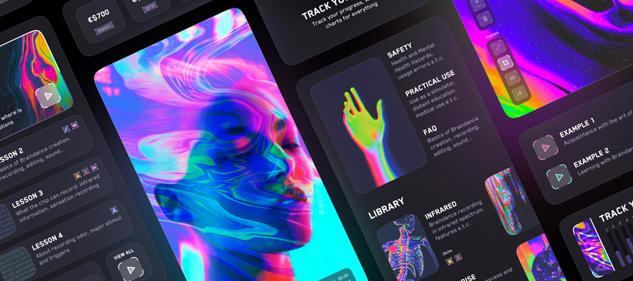
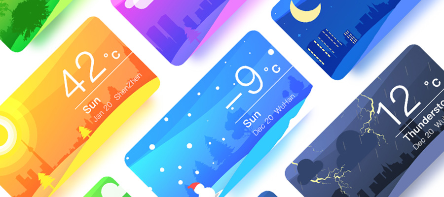
Dealing with a lot of data? Card layouts may be the answer to make an incredible amount of details look less cluttered on the screen. Pinterest was one of the pioneers of the card layout approach on a large scale. This site remains an example of a site loaded with pages filled with card layout organized content.
Material design
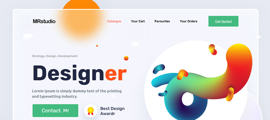
Material design is the developing open source design style launched by Google that is creating a global visual language through design. This consolidation of design makes the transition between different digital interfaces seamless. A common iconography for this design makes it useful to integrate into your website for accessibility and easy recognition. This is a case where it would be good to embrace some material design to better engage with potential customers. Traits of this design style are flat icons and flat sans serif typography with an emphasis on motion and depth in design.
Modern Retro style
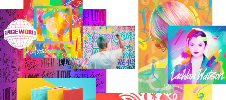
Heavy on design influences from the 1920’s to the 1960’s, modern retro style appears on everything from product packaging to logos. In this style, designers are uncluttering their images and using modern line drawing with some flat elements to create simple images with a nostalgic flair. Neon style design elements in color and form are also popular. Color palettes for this style tend to be muted, the emphasis is placed on clean typography, and badge styles are popular integrated into logos.
Bold and Sleek
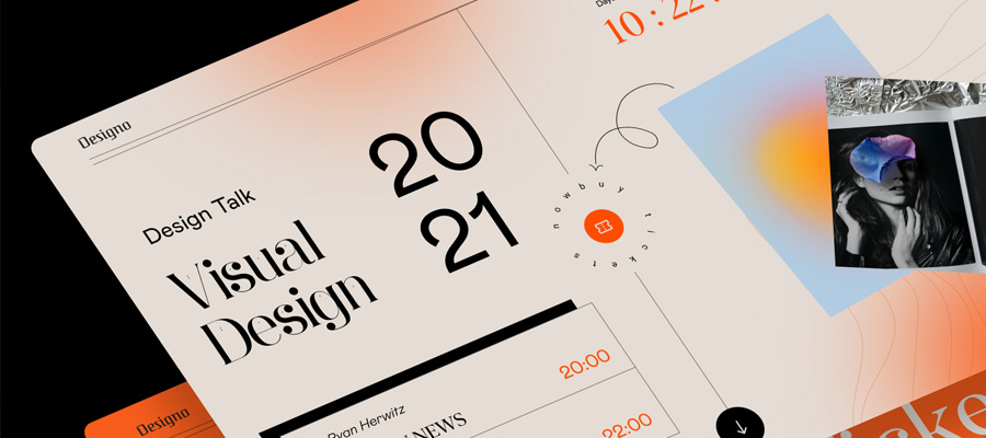
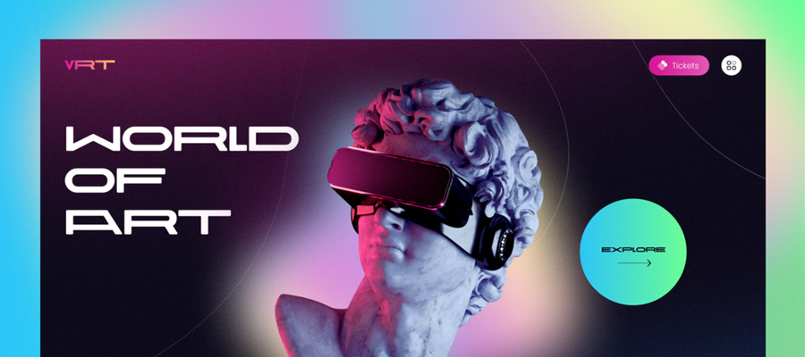
The little cousin of minimalist design, the bold and sleek style turns up the knob on the design volume just a little to deliver a very individual and distinctive impact. This style juxtaposes sharp lines and stacked black and white text with beautiful and bright photography. The resulting effect is high contrast, sleek, and modern. When considering website design choices, feel free to incorporate a couple of these trends into your site in order to add interest and update your look. Be careful to resist the temptation to use design trends that overtake the whole look of your website all at once. To be most effective, make sure that the trends you are incorporating are compatible with your overall brand image.
