In this Photoshop tutorial you will learn how to create the Deadpool movie logo using some really simple Photoshop techniques. Besides standard blending techniques with adjustment layers, masking and using the pen tool to draw shapes or using brushes in a clever way, you'll also learn some tips on how to add more details to your artwork. Keep in mind that it might take you a few hours, but the end result is really beautiful and you will be able to apply these techniques on other future design graphics.
Marvel's Deadpool movie is confirmed to hit theaters on February 12th 2016 (the movie trailer is already out) and with Ryan Reynolds playing comic book character Deadpool, this movie is going to be epic and i'm really looking forward to watch this movie but I also was looking forward to trying to recreate that poster in Photoshop. Like in the previous Deadpool video game, the artwork is also creative, on point and surely deserve our attention.
Since the movie was teased I started to think about ways to do the logo from the poster in Photoshop, so I started looking for assets (even just enjoying wallpapers) and trying to put together the first concept and after a couple of minutes searching for images I found some good ones and had a nice start. As you will see in this tutorial, the techniques behind are pretty simple and straightforward, but the outcome is really cool. I didn't want to recreate it exactly the same because I know that this is impossible due the assets and I believe the original one was done using 3D. This is an intermediate tutorial so some steps can be tricky, but why not have a try.
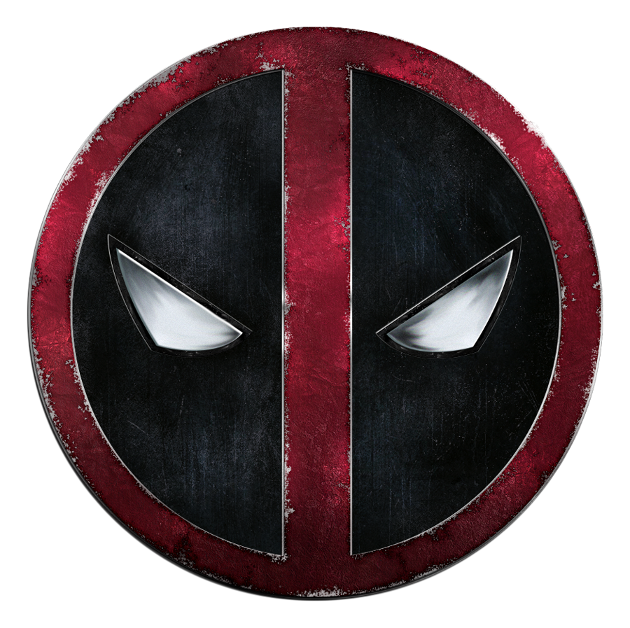
Here is a preview of the final artwork of this tutorial:
Tutorial Assets
The following assets were used during the production of this tutorial:
- texture1.jpg - "Black White Wallpaper"
- paper2.jpg - "Creased Black Paper Texture"
- cracked3.jpg - "Black Cracked Concrete Texture"
- metal4.jpg - "Scrap Metal Wallpaper"
- scraped5.jpg - "Metal Texture"
- grunge6.jpg - "Black Grunge Texture"
- dust7.jpg - "Free Dust Grunge Texture"
- dripping8.jpg - "Dripping Texture"
The main focus of this tutorial is not to make a perfect replica of the original logo, but to introduce you to some simple techniques that you can later use on your other design projects. You will notice I exaggerated most of the effects for better understanding of the techniques. You should tone down the scraping edges and the multiple use of the texture if you want to achieve a similar result with the original Deadpool logo movie poster symbol.
Step 01: Let's get started
Create a new 1000 x 1000 px document in Adobe Photoshop with the following settings:

Step 02: Creating the base medallion
Start forming the base of the logo by drawing a circle shape with the Ellipse Tool (840 x 840 px). For the Fill of the shape select "No Color" and for the Stroke use 50 px.
Draw another vertical shape using the Rectangle Tool (width 100 px).


Merge the shapes by selecting the 2 layers, right-click and select "Rasterize", do this again and select "Merge Layers". Duplicate another base layer for later use, you will need it for the rusty paint effect. Double click on our new layer and use the following settings:


For the gradient use the following colors: #a0a0a0 and #828282. You will find the gradient model in the free psd file to download from the bottom of the article.


Duplicate the shape 2 times in the background, move the 2 layers slightly left and right a few pixels. Duplicate the 2 new created layers and move them slightly down, to create a simple edge effect.

Let's add some texture to our base. Select all 5 layer of the base and right click and select "Convert to Smart Object". Add the "texture1.jpg" to our workspace, chose a big brush for the Eraser Tool (size 270px and hardness 0%) and delete some parts of the texture. Set the blend mode to "Vivid Light" and Opacity to 20%. Make sure to reduce the highlights of the base. Make it a clipping mask of the texture, by selecting the layer a pres Ctrl+Alt+G/Cmd-Option-G.


Step 03: Create Rusting Paint
For the red rusty paint effect we will use different textures and blending modes, with some color correction brushing. Let's get back to our previous saved base layer shape, double click on it to bring the Layer Style settings, and change Color Overlay to #a51f3b. Right click on the layer and click "Rasterize Layer Style". Open again the Layer Style setting windows and apply the following:


Next step is to place the "texture1.jpg" on top and set the blending mode to "Overlay". Be sure to make it a clipping mask using the Ctrl+Alt+G/Cmd-Option-G shortcut.

Reuse some small parts of the same texture to add details. Be sure to blend the edges with the "Eraser Tool" soft brush to make the composition seamless. Set the blending mode to "Luminosity" and make them clipping masks to the base layer. Don't be afraid to use a lot of parts of the texture to make it look just right.


Make a new layer on top, select the "Brush Tool" (size 300px and hardness 0%) and pick the #a51f3b color. Paint over the layer to dim the background texture a little bit. Set the layer opacity to 60%.

Let's add some paper texture, put the "paper2.jpg" on top, set the blend mode to Color Dodge and opacity around 90%. Make sure you erase the parts you don't want. Make it a clipping mask like in the previous steps.


To make it more close to the original, we will add some small cracks on the logo. Put the "cracked3.jpg" on random places, be sure to erase the edges. Set the blending mode to "Color Dodge".

Make sure all the texture layers are clipping masks of the original base shape (select the layer and press Ctrl+Alt+G/Cmd-Option-G).
Step 04: Peeled edges
The design is quite simple as you can see, in this logo tutorial we will explore a method of rusting metal without having to wait for nature to do it for us. There's still quite a few fine tunes to be made, especially for the rusting edges. The technique is very simple and I am sure it will come in handy in other design related graphics.
So we have this gorgeous layer of paint, next step is to recreate the peeled edges effect a really simple technique, without any new brushes. Let's get back to the main red rusted paint layer. Pick the Eraser Tool and select a small brush (around 3px), toggle the brush panel and apply these settings:

Delete small portions and experiment with this, see what works. Try to cover all the edges, don't over do it, but keep in mind that details matter. Take my example for reference:


Step 05: Drawing the Eyes
Create a new layer on top, and then select the Pen Tool and draw the shape of the eyes (use the white part of the original logo for trace reference).

Right click anywhere on the canvas and select "Fill Path", use a white color for the fill of the shape (to exit the pen tool mode, select the "Pen Tool" and press Esc).

So now we have the main base shape for the eyes. Save a copy of the base for later use.
Let's paint the eyes, create a new layer on top, make it a clipping mask (Ctrl+Alt+G/Cmd-Option-G), then select a small black brush (size 10px and hardness 0%) and draw some lines in the corners of the eyes (pretty basic stuff). Go to Filter > Blur > Gaussian Blur (radius 3.4 pixels).

Use the Smudge Tool to refine our "black highlights" (size 17px, strength 50%).

You may want to soft blur it again before continue smudging the composition. If you feel you need some gray now and there use #4b5358 color (use my example for reference). Smudge it up!
When you finished, go to Filter > Sharpen > Smart Sharpen and use these settings: Amount 476%, Radius 3.8px, Reduce Noise 30%.

Also, add a small white "Inner Shadow" to the layer style to make the edges pop. You can add more "inner shadow" effect until you got something you like.

Next we will make the black edges of the eyes. Repeat the process from the previous step, draw the shape using the Pen Tool, fill it with a black color, and place the "metal4.jpg" on top of it and make it a clipping mask (Ctrl+Alt+G).

Double click on the layer to open the Layer Style and use the following settings (one Stroke and two Drop Shadow):

Make a new layer on top of the black shape and draw some white noise spots with a little brush (a few px in size) and smudge it up a little (alternative, you can use some textures to achieve the splatter paint effect). As you notice, i also draw some black lines around the shape, to give a little bit of depth.

For the other eye the steps are the same, except for some minor changes on the layer style settings. You can duplicate the layers and mirror them (Edit > Transform > Flip Horizontal), but keep in mind that you need to make some adjustments on the Layer Style, like in the pictures below:


Step 06: Blackground splatter paint effect
Place the "scraped5.jpg" texture on the back of the logo. Make a circle selection using the Elliptical Marquee Tool, copy and paste it in the same place.

Select the Burn Tool (size 250px, Range: Shadows, Exposure: 25%) and darken the parts around the eyes and the inner edges.

Use the "grunge6.jpg", "dust7.jpg" and the "dripping8.jpg" textures to add some nice details to background. Use parts of the textures where you feel the need to add details to the composition, to make everything blend together we'll use the following Blending Modes:
- grunge6 - Screen, Opacity: 100%
- dust7 - Lighten, Opacity: 100%
- dripping8 - Divide, Opacity: 25%

Step 07: Final adjustments
We've finished adding all the elements, so now it's time to color the logo. Use a Vibrance adjustment layer to enhance the final effect (Vibrance +52, Saturation -4).
Make a new blank layer, use the shortcut Control+Alt+Shift+E (Command+Option+Shift+E) to "flatten" a copy of the layers onto the empty layer. Go to Filter > Sharpen > Smart Sharpen and use the following:

Add some noise, go to Filter > Noise > Add Noise.

Final Result
I hope you've enjoyed this Deadpool Photoshop tutorial and learned some new and simple techniques.

As always, you're very welcome to share your feedback and outcomes in the comment box below. Now go get yourself some chimichangas!

