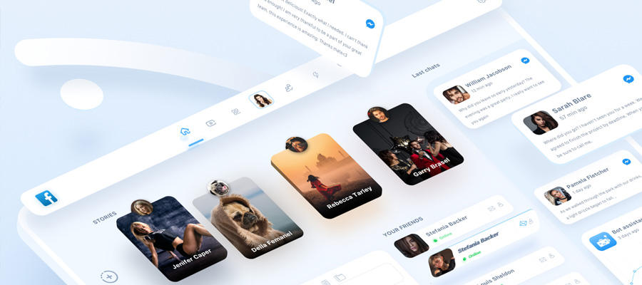
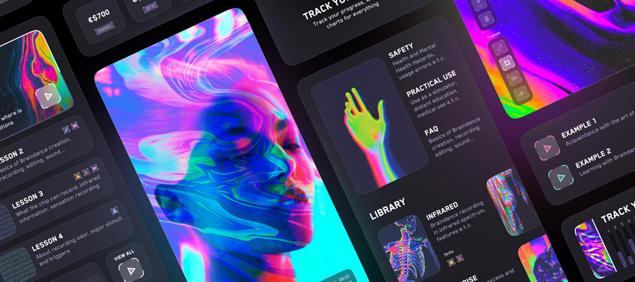
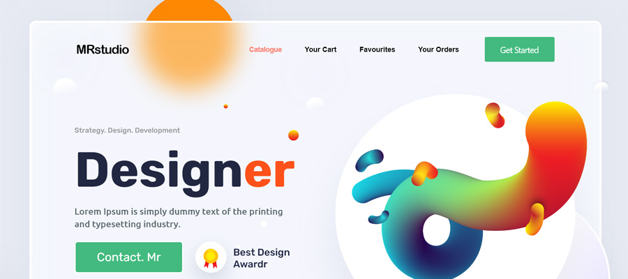
It doesn’t matter whether you’re a fashion brand, a law firm or an online electronics store, you need to create an attractive website if you want to make sales. The more creative you can be with your web design, the more compelling your products and services will be to the people who visit your website. So, here are some creative ways to make your website more attractive:

Whitespace
Whitespace is something that doesn’t get enough attention. It is the space between the various elements on a web page, so it might seem insignificant to some. However, website designs that are too cramped can be difficult to read, and the hard work that you’ve put in creating interesting images and selecting the perfect fonts will be lost when it’s all squashed up together. So, look at your web pages, and ensure that you concentrate as much on the space as the content/images you include.
Think About Fonts
Choosing the right fonts for your website is about more than just ensuring that your words are easy to read. Believe it or not, the way a word looks can have an emotional impact on the reader and can give them a sense of what the company/brand is about. That means that the kind of fonts that work with professional medical and law firm website designs will be different than the fonts that look good on a children’s toy website, for example. Google Fonts is a great tool that will enable you to find the best possible fonts for your project; the fonts that scream professional, funky or fresh, depending on what you’re looking for.
Pattern and Texture
Your computer screen might be flat, but that doesn’t mean that your web pages have to be too, and if you want them to stand out, they really shouldn’t be. That’s where patterns and textures come in. Adding repeating patterns, and textures which give the page a 3d look will instantly make it more eye-catching and dynamic, which is exactly what you want when you’re trying to make your website more attractive to the average reader.
Customized Icons
Websites need menu icons to point visitors in the right direction and make their experience as simple as possible, but standard text icons are kind of boring to the average person. So, get creative and add unusual icon sets to your menu. Base them on the theme of your website, and they will not look out of place.
Take Your Own Photographs
If you have photographs on your website, and you probably should if you’re selling stuff, even if you’re selling services rather than products, because visuals are much better at grabbing attention than the written word most of the time, always try to take your own images. Stock photos might be freely available. And they might, for the most part. Do the job, but they usually aren’t very creative., White backgrounds with a bog standard image in front are hardly inspiring. If you want to wow your visitors, you need to take dynamic, innovative images that are clearly unique to your own website.

Add a Flash of Color
If your website already has an established color scheme, one thing you can do to make it even more attractive is to add the occasional flash of another complementary color, perhaps on every third page or in a header, just to surprise the visitors and make them pay a bit more attention.
Extend the Footer Area
Making the footer area of your website larger will immediately help your website to stand out because most sites leave the footer area fairly small. Of course, extending it without a purpose would be silly, so try to think of unique ways of using the space, perhaps by including meta links or posting interesting and inspiring quotes you think your visitors will dig.
Make Your Images Responsive
If the images on your websites are still static, then you’re well and truly behind the times. At least some of your photos should be responsive, changing and morphing as the user looks at the site. It’s easy to make this happen by altering the img elements in CSS.
Image Box Shadows
Adding image box shadows will add some atmosphere and intrigue to your images by warping them with a border that makes them pop out and immediately catch the eye. There are numerous tutorials to help you do this online
Doing all of the above should make your website appear more interesting. Combined with excellent content writing and a little marketing know-how, it won’t be long before you see a huge improvement in your visitor numbers and sales.


