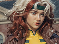
We designed an iOS 26 Clear Colored Icons concept that keeps each app’s original glyph or logo color while using a transparent, liquid glass backdrop design. The goal is simple: keep the aesthetic cohesion of Clear icons while restoring the brand color cues that help people find apps faster and reduce cognitive load. Our tests are visual explorations, not an Apple feature, and we will showcase high-resolution screenshots throughout this design exploration.
Why we built a “Clear, Colored” variant of the iOS 26 icons
Apple’s new glassy icon style is beautiful, but making all Clear icons the same color trades recognizability for uniformity. Color is not just decoration. It is a perceptual feature that supports visual search and recognition. Classic visual-search research shows that basic features like color guide attention and can “pop out,” improving target acquisition time in cluttered displays.
Recent HCI work goes further, reporting measurable effects of icon color combinations and gradients on accuracy and speed during icon search tasks. From a usability standpoint, well chosen icon color enhances information scent and scanning efficiency, especially when paired with distinctive shapes.
Clear icon style that preserves each app’s glyph color should improve recognition time vs. monochrome Clear sets, while keeping the cohesive “liquid glass” look.
What our concept changes
- Transparent background, real brand hue: the pane is clear, but the glyph retains its brand color.
- Subtle glass behaviors: soft reflection and edge speculars to match a “liquid glass” aesthetic.
- Adaptive contrast logic: automatic micro-adjustments to glyph brightness against busy wallpapers to maintain at least a 3:1 non-text contrast ratio for perceivable icons.
- Respect for platform guidance: we keep Apple’s HIG principles for icon clarity, simplicity, and color use, adapting them to a transparent substrate.
The recognition and accessibility argument
Recognition speed. Color is a preattentive channel that guides search. Restoring per-app hue gives the visual system more hooks to latch onto, which should lower search time on dense home screens. This is consistent with Guided Search models and decades of empirical findings on color and visual search.
Contrast and legibility. Icons are non-text graphics and should meet WCAG 2.1 SC 1.4.11 with a minimum 3:1 contrast against adjacent colors, even with minimalist shapes. Transparent panes on photography can tank contrast, so our concept uses on-the-fly hue shifts and subtle inner glow only when needed to keep legibility without killing the “clear” look.
Color vision deficiency. Roughly 8% of men and 0.5% of women experience some color-vision deficiency. Designers should not rely on hue alone. We keep distinct shapes and stroke weights, and we optionally add a thin neutral outline in high-risk palettes.
Some good Apple Design System details to take in consideration
1) Color mapping
- Primary glyph color: start from each brand’s canonical HEX.
- Adaptive adjustments: compute relative luminance against the current wallpaper sample window. If contrast falls below 3:1, raise lightness or add a neutral outline at 1 px device-scaled thickness, then re-test.
- Vibrancy compatibility: respect platform vibrancy so glyphs do not fight dynamic materials.
2) Glass substrate
- Base: 92 to 96% transparency plate with a tight edge highlight and a faint inner refraction.
- Reflection: single specular streak that tracks icon tilt, capped to avoid washing out low-saturation glyphs.
3) Shape language
- Keep Apple’s rounded superellipse, avoid micro-textures, maintain a consistent optical center.
4) States
- Focused or jiggle mode: raise the neutral outline to ensure contrast on motion.
- Dark vs light environments: do not invert brand hues; adjust only for contrast thresholds.
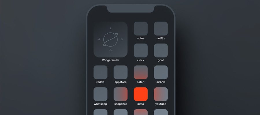
Can you use custom icons on iOS?
Yes, with caveats. You can use the Shortcuts method to assign custom app icons that use transparent plates and per-app glyph colors. It looks great, but you will hit known tradeoffs like launch-through Shortcuts for some apps and fewer dynamic effects. For a real system-level result, Apple would need to ship a proper “Clear, Colored” mode.
Implementation ideas Apple could ship in future betas
- Color-preserving Clear mode: a system setting alongside Dark, Automatic, and Tinted that preserves each app’s glyph color at user- or developer-defined saturation levels.
- Contrast-aware rendering: real-time sampling under the icon to apply micro-adjustments until SC 1.4.11 is met, similar in spirit to system adaptive colors.
- Developer API: an asset slot for a color-safe glyph on transparent background, plus a manifest declaring preferred fallback colors for CVD-friendly variants.
- Accessibility tie-ins: if Increase Contrast is enabled, bump outline opacity and disable strong speculars.
How we built the icon exploration
- Redrew or isolated monochrome glyphs, applied canonical brand hues, and placed them on a transparent glass plate.
- Tested against noisy wallpapers, running automated contrast checks and applying minimal corrections only when the ratio fell below 3:1.
- We kept screenshots at good quality, for crispness. The micro-highlights, refraction edges, and texture-free glass look hold up at Retina pixel densities.
Little Useful FAQ
Is this an Apple feature?
No. This is a design exploration that follows platform guidance and accessibility standards.
Why not just tint everything one color?
Monochrome tints can look cohesive, but they remove a powerful preattentive cue. Color helps users find targets faster when shape and position are not fixed.
Will color hurt people with color-vision deficiency?
Relying on color alone can hurt. Our concept pairs hue with shape, outline, and contrast management, plus optional CVD-safe variants.
Practical guidance for designers
- Start with brand color, then test against 6 wallpaper archetypes: light blur, dark blur, saturated photo, pastel photo, high-noise texture, and gradient.
- Always maintain at least 3:1 icon-to-background contrast. Prefer 4.5:1 when the glyph carries essential meaning in isolation.
- Provide a CVD-safe glyph variant for red-green conflicts. Keep a neutral outline that passes in both light and dark contexts.
One more thing
Apple will probably need to add full hardware ray tracing in the next iOS 27 version, to keep up with all those new visual rings and bells :)


