We can bet you have already heard quite a bit about responsive design. This feature was around for several years now as people started accessing web pages from devices other than computers. If you want your corporate website to be responsive, as usual, you may consider custom development or template customization. In either way, it is crucial to maintaining a usable UI. After all, a responsive design is all about the convenience for visitors. In this article, we’ll present responsive website examples to give you a more complex idea of what they look like in 2017.
So, once again, what is responsive website design?
It is a special technology that makes a web page display well on any device and screen resolution. It uses HTML and CSS to fulfill its aim. Why is it good? Simply because it enhances UX. A person gets perfect experience regardless of the place, time, and device. Whether it will be a tablet, a desktop, or a phone, the website should layout smoothly and be within the screen (that is, to display at 100% size).
Good examples of responsive design have this:
- Ability to adapt to any screen;
The distinctive feature of adaptive websites is the ability to display correctly on any screen without losing any information or functionalities. Thus, you will have neither all the page elements pressed together in one block, nor the half of the features completely lost. Instead, you get the perfectly normal-looking website regardless of the device used.
- No necessity to fix the versions separately;
One of the most useful features of responsive websites is their maintenance simplicity. You don’t get a bunch of different layouts (aka sites), but one version that adjusts to any device. Thus, if you introduce some changes to, let’s say, a desktop website, they will be implemented to fit any screen correctly.
- Level canonical issues;
It is also crucial for designers to be able to avoid duplicating content. In traditional design, they use canonicalization to cope with it. Whereas, adaptive websites let them completely dismiss the canonical tags. As long as there are no separate versions of a single site, but one integrative responsive piece, duplication is no longer an issue.
- Level the problems with inbound links.
All businesses are now in a race to the top of the search engines rankings. One of the important components to this is having a decent number of inbound links. Responsive design solves the issue with them as there is only one link to the source, not multiple (i. e. adding an “m” in front of the link for a mobile version). For a search engine, it is great when the links come from both desktop and mobile devices. Especially, when the URL is the same.
How to build it?
Basically, what Pandawerk experts do when they create a responsive website is “tell it” to layout in a particular way. Each device has a certain viewport size (what you see looking at a web page). To make the site adaptive, one needs to use a <meta> tag:
<meta name="viewport" content="width=device-width, initial-scale=1.0">
It tells the contents of the page to layout correctly considering the width of the screen.
Another important thing is media queries. In simple words, those are points on which CSS rules can vary. In terms of coding, it helps the page to layout correctly in respect to the width of the screen, for example.
Those were some technical details. Now let’s move on to our examples.
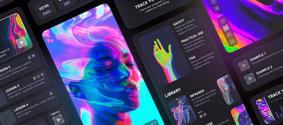
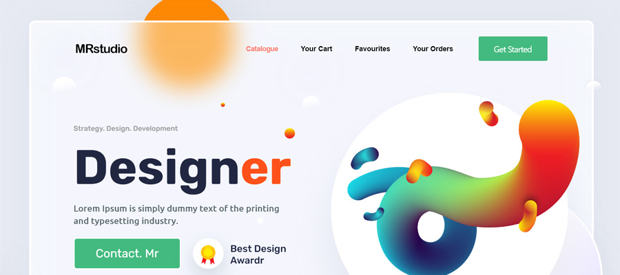
Responsive Website Examples 2017
In Pieces


This website tells about the endangered species in an extraordinary way. It is one of the good examples of responsive websites, as it preserves stunning animations regardless of the screen size.
Protest


Protest is a responsive online shop making it convenient for visitors to see all its products due to a usable catalog.
MENDO


MENDO is an online book store. It demonstrates great layout on different screens preserving all the functionalities.
SIRIN LABS


SIRIN LABS demonstrates stunning animations for its promo website. It is preserved even on the small screens.
HUGE


This example of a responsive website shows how big platforms can be more usable. Its convenient and intuitive layout greatly improves UX.
Product | Jagermeister


Jagermeister did a great job with this promo website creating an interactive catalog for drinks. And it is responsive!
KEEN


KEEN is a major web store for footwear. It demonstrates the convenience of responsive design for ecommerce websites.
The Fit Mother


The Fit Mother is one of those simple responsive website examples that astonishes with its usability and clear design. Responsiveness adds even more value to it.
ESPN The Body Issue 2017


This ESPN sportsmen gallery supposedly represents an idea of body positivity. This complex thought is embedded in a stunningly beautiful responsive layout.
RONIN Amsterdam


RONIN design studio is a final chord of our list. A responsive design of the website is beautifully simple, but usable.


