Choosing the right font is as important as choosing the right words. If the words are perfect and give out the exact message that you want to convey but the font you are using has a low impact, the whole of your content will fall flat. After the imagery, fonts are the most important elements that grab the audience’s attention.

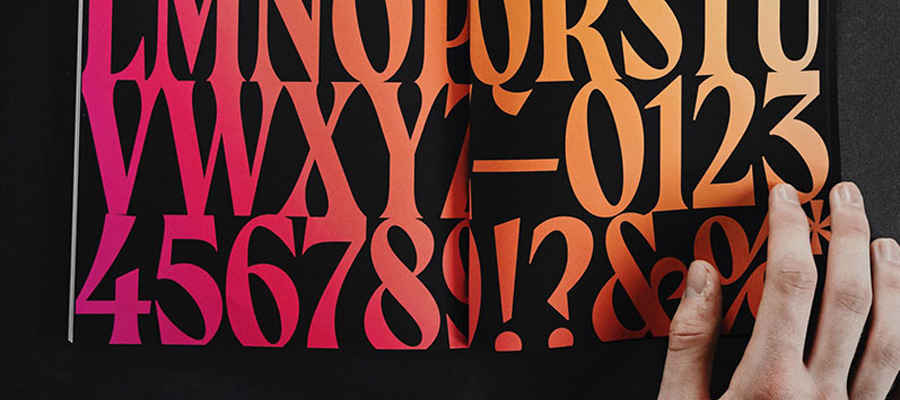
Reverse contrast italic 'a' study by Neil Secretario
The right font has a major impact on the whole look and feel of your design and content. That’s the first thing the audience will notice when they’re reading your content or looking at your website.
Different fonts tell a different story
Different brands have different stories to tell. The font that you choose to tell your story should be as unique as the brand itself. All different brands have their own ways of communicating with the consumers to push their message across and stand out amongst the competition. They use different elements relevant to their brand to resonate with the audience. One of the most important elements is the font style that they choose to use. Different brands and platforms use different font styles to convey their message.
For example, a beauty brand would use a font style that matches their brand image, colors, content and resonates with the target audience. Similarly, you need appropriate fonts while designing banners. If you have a spring background then you need colourful fonts. And if you have a glitter background then you need plain, simple font.
It is important to note here that the same brand can also use different font styles for its different product ranges. For example, a shoe brand can use one type of font style for its product line for kids and a different style for the product line for adults. Then there can be further divisions based on gender. A serious and to the point tone of text for the men’s shoes and a more relaxed and colorful font style for the women’s shoes.
Using the right font style that communicates your brand image and message well across the market is important to have maximum impact and attract the right type of target audience. When the right kind of people are attracted to your brand, there is a higher chance of those leads turning into potential consumers of your products in the future.
Using font styles irrelevant to your brand image will only attract the wrong audiences. Font styles that are not in sync with your brand image will only push the potential consumers further away because they will not be able to relate to your brand. In order to make your brand’s communication visually appealing yet clear to the right audiences, you need to find the right font styles to use that are related and in sync with the design elements of the brand.
Is it a hit or miss? Or can you know for sure what works best for your brand?
If you’ve been in the market long enough, you would probably know your consumers well by now and would know what works best for your brand. But even then, there can be times when what you think would be successful may prove to be not so fruitful and in your favor. For newer businesses, it is a little different and can be more challenging. They need to identify the right elements to use that will help them with their communication.
They also need to experiment and find what works best for their brand and its identity. But the experiments and risks need to be well thought out and calculated so they give them an edge over other brands with similar products yet don’t go too overboard to give the image that the brand is trying too hard.
Mixing and matching different fonts will help you find the distinctive font style that you want to go with for future communications. It has to be attractive to the target audience yet in line with your brand image and identity.
There’s a font style for every communication medium
Communication is not just about the words that you use, it’s so much more than that. If you really want to communicate well, then you need to take a lot of things into consideration such as the design, the tone, the font, the color, the content and the imagery of your communication plan.
Different communication mediums use different fonts to put their message across. It’s all about the message that is being conveyed to the audience and its main focus. A writer will use a font that is easy to read and is clear without unnecessary details that might act as a distraction. A designer will use a font that is attractive and aesthetically appealing to the eye of the viewer yet not too overboard that it will affect the readability of the text. A tattoo artist will use tattoo fonts that compliments the design of the tattoo and the person that is getting it.
So it is important to identify what font style to use with what kind of communication medium because a font is what the readers will associate most with rather than the text itself.
Fonts and their personalities
Different fonts of a text have their own unique personalities. Using a number of different fonts for the same text will recall different images and feelings in the brain of the readers. Each font will have a different and unique feel attached to it that the reader will get every time he/she reads the text. Even if the content is the same, you can give out different messages by just playing around with the fonts.
Some font styles will have a feminine and elegant feel to them while some will have a masculine look. Similarly, some font styles look as if they are meant for the kids and some look more refined and conservative.
Using the wrong kind of font can also negatively affect the impact it has on the readers. For example, using a cursive font to give out a serious message will not have the same impact as using a traditional and defined font style will have. Similarly, using a rustic and vintage font to address children will not feel the same casual and funky way as using something more fun like the comic sans.
Finding a font that is a reflection of you
When choosing a font for your text or art, you need to first define what kind of feelings you want to evoke in your readers. More than just picking a font that looks good to you, you need to know what it will feel like for the readers. For that, you would have to know your brand well and you would need to be clear about your communications and what you want to convey to your audience.
The font that you end up choosing will stick with your brand for a long time and it will define the whole look and feel of it. So take some time, experiment a little, see what works and what does not and then come to a conclusion about what you want to choose. Remember, your font style is like a reflection of your brand, choose it wisely!


