There are almost a billion websites today, how would yours stand out?
And stand out it would have to if you want to inch ahead of your competitors.
While your products and the amount of effort and money you put in your website matters, there's also that element of creativity that can change the face of a website.
If you're in the process of setting up your website or redoing an existing one, consider these 14 ideas that can either subtly or dramatically transform your website. Just cut through the clutter and make the right noise.
1. Video Background
With less than 6 seconds to hold your reader's attention, you need to go all out. And a video background is bang on target.
When you have a video playing in the background and it catches the attention, they would stick around because no one can leave a story midway. Our brains have been wired to solve the puzzle, fit the pieces so when the video starts and is even remotely eye-grabbing, you can be assured that they are going to stay a little longer.
Will they watch the entire video? Will they convert? Now that depends upon the quality of your video. So you have to pay due attention to whats and hows of that as well. Eagleclean is a brilliant example of this done right.

And if you're wondering if you'd have to sell a kidney for this, then be assured of the safety of your kidneys. All you need is someone who has a DSLR and good shooting skills, and you have a stellar video shot and up in no time. Or if you think you're pretty decent yourself with a DSLR and would like to do everything in-house, here's a free guide on creating stunning videos with your DSLR, you'd practically be redoing your website for free.
2. Use complementary fonts
Why the boring old Times New Roman? Agreed you’d like to stick to the time-tested formulas but there are so many great font options that don't just look good but also complement your theme. Plus the right fonts can be great for randing as well.

There are tons of places to search for relevant fonts, here's a great set of fonts for websites that have fashion or luxury as their theme.
3. Beautify overlooked aspects
If you were to count the pages and aspects of a website that are ruthlessly ignored, a login page would feature pretty high on the list. Most designers and webmasters opt for the custom login page.
But what they don't realize is that this is the point of contact between you and your readers, and adding a creative touch not just gives you the added advantage (no one else is doing this) but it also gives your readers something extra keeping your site top of their mind.
From a functionality point of view, beautifying a login page doesn't mean anything but think aesthetics and think branding. If you're thinking the cost again, here's a way you can do it for free and without any prior coding knowledge!
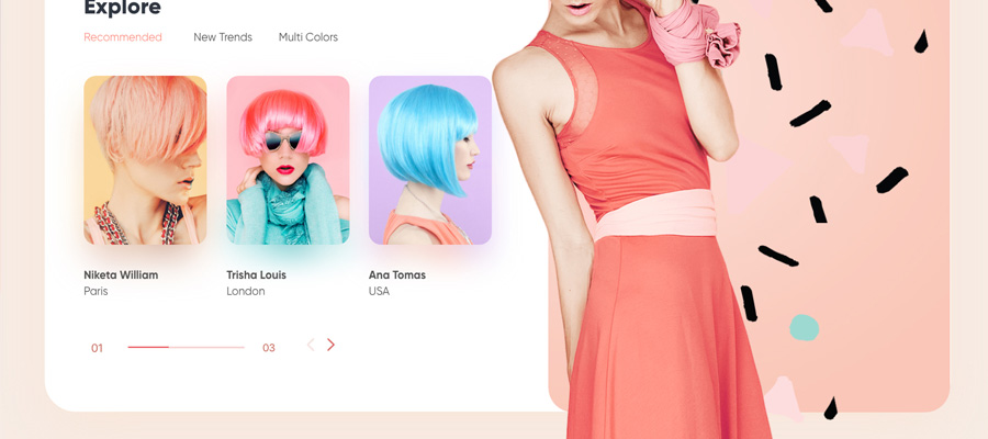
4. Sliders are passé, or are they?
Most designers hate including sliders on websites but most clients love them. Sliders aren’t going to make your readers click on CTA, but they can aid that.
The number one reason to include sliders is you can direct focus right where you want it. But we’re not just talking about routine generic sliders, the one that every website has. We’re talking sliders that have that wow element like this one that comes with Ken Burns effect. The Ken Burns effect is a pan and zoom technique that gradually directs focus to the object in the still image.
This would be befitting for websites that have a good chunk of images, like a portfolio.
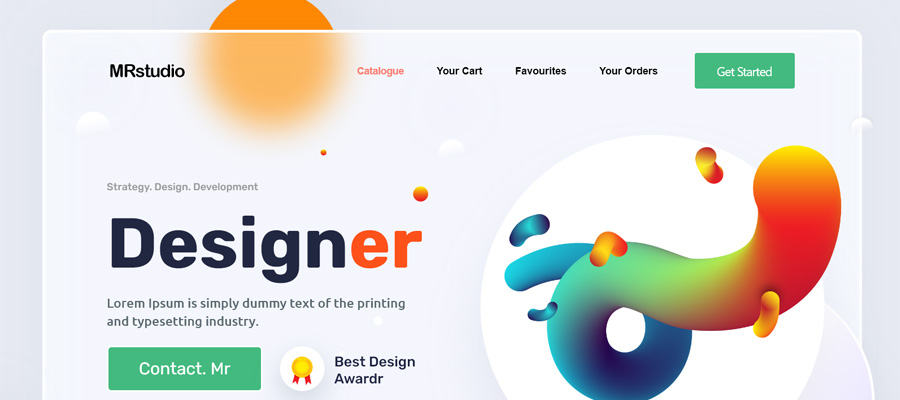
5. Pay attention to the images
Every website – even if it’s about the most boring topic in the world- will have tons of images on it. And images are more attention-grabbing than texts, but still you see a lot of websites with inferior quality and pixelated images that just don’t work.
First off, avoid the generic Shutterstock images and invest in a set of professionally clicked ones, especially if your website is mainly product-based. This is one investment that’s worth its weight in gold. Even for information-based websites, it’s always recommended to get professional shot clicks. In fact, if you yourself are well-versed with the basics of a DSLR, you can create stunning images by learning a little about it, here's a free e-book you can start with.

Also, besides the clicking part, understand the post-processing part too. This is the other side of the coin and you’d have a lot of fun doing this. Create stunning post-processed pictures even without a lot of nuanced knowledge of Photoshop with resources like this on cinematic effects.
6. Increase functionality with aesthetics
There are so many smaller changes you can make to your website that add some mojo to it.
If you are in the process of launching your website or are undergoing temporary revamping, you can use a countdown timer plugin that both creates curiosity and keeps the readers informed.
A countdown timer plugin– at least the one that comes with changeable skin options – can blend with the color scheme of your website adding to the overall look. This might seem like a small subtle inclusion but you don’t know how powerful of a sales move this is, curiosity is a potent emotion driving sales. And if you get their attention, you can keep it too.
Plus it doesn't leave the existing readers wondering what on earth happened to your current website, and they don't just wonder they might even abandon your site in lieu of your competitors.
Another subtle change that is a powerful marketing tactics is animating images. These don’t need to be professionally done, you can make a generic change and get bigger returns.
Even something like creating a flipbook for your images will work wonders. This would especially befit a website that showcases a lot of images like portfolio work and product pages. It’s a fresh new concept and readers would be intrigued and keep flipping through the pages.

But if you think subtle flipping through images isn’t cutting it for you and you want actual animated elements on your website but again at an affordable price, we get you an option for free. This freebie gets you animated elements that you can easily integrate without making major changes to your website. Animated effects like falling snow flakes and rains are a great way to spruce a website that has a fun theme to it, and this gives you a chance to do something extra without putting in too much time, effort, or money.
Have you ever considered using ribbons to add a touch of happy-feel to your website. Happy-feel, rally what does that even mean? Ribbons are associated with happiness; you’d generally see them on gift packaging and certificates so it automatically induces a nice feeling.
 Using ribbons on websites for discounted products or loyalty programs increases the happy-feel of a website. But should this only be included in websites that have an informal, fun element to it? Ribbons are so versatile, you can even work this on a business website. Just add your creative flair to it and rehash this for any type of website.
7. Beautify the basics
Some of the basic elements that every website has are menu options and icons. Now, when it comes to menu options most webmasters go with the old boring drop down menu tabs. But have you considered the many cooler ways to organize your menu topics. A semi-circular menu option or a mega menu option for starters.
Another basic on every website is icons. There’s no imagining any website without some sort of icons on it. You need icons in between texts, you need these for the Call to Action buttons, you also need icons in manuals and presentations, so it’s only important that you stock up on a good variety.
There are tons of freebies online where you get an assorted mix of icons, ranging from the absolute basics to specific ones that can be included on invites and posters. Then there are business icons too that you would have a need for in business and finance related websites, here’s a great set of free business icons you can download if yours is a business website or if you work on a lot of business-related websites.
Another time you need icons for – and this is the most common use for icons on most websites – is when you need to introduce social media sharing. Have you ever noticed those floating buttons on the side or at the bottom of the page that links to Facebook, LinkedIn, etc.? These are the social share icons that promote visibility by sharing your content on social media platforms, so you would need these time and again too.
8. Keep abreast with new style inclusions
Parallex effect that makes the foreground and background load at different speeds on the website, giving it a 3D feel is a big thing in the web designing world. The concept has only been recently reduced as a design style and works brilliantly with certain websites.

While you should understand and be aware of new style inclusions, you should also judiciously use them. Going overboard – like a lot of designers do – will only end up creating a jumbled up website or one that comes off as show-offish.
When you’re out to create a website that’s intended to be different, you have to work harder and smarter, but above all you need the resources to build a class-apart website. We hope you found these ideas worthy of being included in your next project. We’d love to hear what you think of these.