People select one-page website design because it is easy to build. Of course, there is still a lot of effort involved to obtain a website that is both easy to use and good-looking. Many people believe that single-page sites don’t require the same amount of effort and time. But the truth is that a handful of principles must be respected to obtain the wanted outcome in the end.
This article lists the five most important aspects that one-page websites should feature. All the principles listed here should be considered valuable pieces of advice. They should be applied to any one-page website. A short description of each of these aspects, along with suitable examples, was also added to the list. This was done in order to help you understand the topic better, even though you might not be a tech-savvy person. There’s nothing too technical or complicated here, so rest assured. Here’s the list:
1. What is the purpose of the website?
Building a website without knowing what it’s purpose is might not turn out great. Why? Without an objective-centered design, the website might end up disorganized. It can be confusing for the user. One-page layouts are used when the purpose of the website is clearly stated. For instance, these websites can be used to:
- Sell a product/a service
- Present a portfolio
- Publicly announce an event etc.
The website examples listed below should help you. You will understand how purpose-driven websites keep users engaged. These websites provide users with the exact information they need. They do so without distractions or any other downsides (e.g. loading slowly):

On this website, users will be welcomed by a series of interactive effects. They are well-optimized, not causing any issues in terms of loading and keeping users entertained at every click.

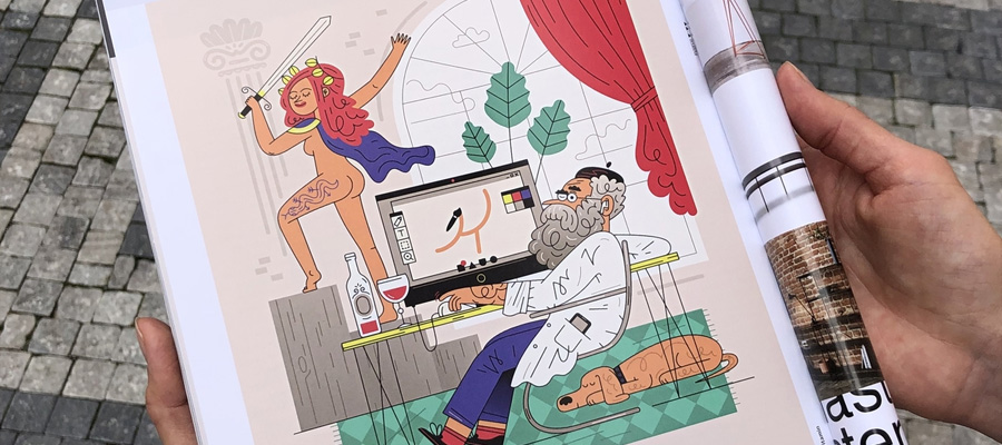
This one-page template is offered by BeTheme, a provider for responsive pre-built websites. As you may notice, the site features static images and simple CTAs. These elements make it a dynamic website, perfect for those who know exactly what purpose their site will have.

This one-page layout includes many animated items and personalized illustrations that sustain the main goal of the site. All items are properly optimized to prevent slow load speed or crashing.

Websites that are meant to encourage visitors to buy a product should be centered around simple design and CTAs. This one-pager is a good example of product-selling design.

This website is the perfect example of how to include images in a one-page layout. The website also features sliding effects and a nicely designed CTA button.

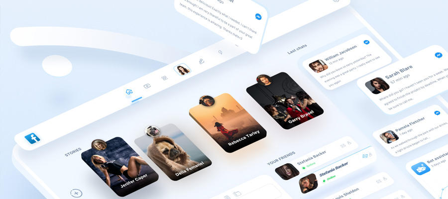
One-pagers are ideal for presenting apps because there is not much information you need to include. You should rely on visuals and interactiveness, as in this example.
2. How about content?
There are situations when websites are built perfectly. But the content presented is just irrelevant for the purpose of the website. It acts as a distraction instead of informing the user about what he is interested in.
You can’t fill websites with information that is not curated or relevant for the topic of the website. Moreover, using huge blocks of text will make the content impossible to read. We live in an era where everyone is on the go and time is the most valuable resource. You can’t afford to steal the time of the user with nonsense content. Keep it short and concise, just as in the examples listed here:

This website features a menu in the upper side of the website where several categories are listed. The written content is separated into sections and combined with visuals.

The bullet points on this website is a perfect example of how text content should be separated in small bits.

The text content on this website is almost absent, as the services offered heavily depend on visuals.

The content is kept to a minimum, but it answers all the questions that a user may have about the products.

Cars are difficult to sell, but Mercedes-Benz knows how to stir the interest of their users.
3. Positive and negative space
Whenever a person visits a website, they trace a pattern with their eyes. When the website is filled with text, people tend to skip lines and read the information in an F-like pattern. Contrarily, when the website features a lot of images and visuals, the pattern changes to a Z-like one. If too much content is included on a page, the user might get tired and leave the site in an instant.
Positive and negative space are concepts used in design, art and other fields. Positive space refers to the visuals that are included on a website. While negative space has to do with the portions of the site that are left blank. Using negative space is highly important in website design. Especially with one-page layouts because it allows the user to rest his eyes. Furthermore, it creates a balanced visual effect.
These are a few websites that make great use of positive and negative space:

The images used on this website are impressive, but they are too much to fill it entirely. This is why negative space has been included in the design – giving the one-pager the needed balance.

The product photography services offered on this website couldn’t be emphasized better. The use of negative space is mandatory for similar one-pagers because they accentuate the services’ quality.

Another example of a perfect pre-built one-page website, Be Dietitian 2 is based on colorful visuals, negative space, and convincing CTAs.

This is a good example of a minimal website with a clear navigation system that relies on negative visual principles. The site is simple, yet pleasurable to use.

Who would believe that someone can present nasal drops in an artistic manner? This website is the existing proof that good illustrations, photos, and negative space combined can lead to a great result, regardless of what product is presented.
4. Good website navigation and usability
A one-page website can look great. But it can make visitors leave it in an instant because of how slow it loads and how complicated navigation is. The purpose of any website is to offer a smooth experience to the users. This means that design should go hand in hand with usability.
To make sure that users won’t get lost on your website, include a sidebar menu or a horizontal stick one. Infinite scrolling is not the best idea if you have a lot of information to present. Instead, use an auto-scrolling option. It sends users directly to the category they are looking for. The websites listed below have user-friendly navigation systems:

People can rapidly access one of the three sections of the website: learn more, portfolio and contact details.

This is a very innovative navigation experience that can stir the interest of the users while keeping them occupied on the website.

This is a dynamic website, with a pastel color scheme. Because there’s not much text content included on the one-pager, users can cover everything they need to know with just three mouse scrolls.

Talking about the use of navigation menus, this website has two: a fixed one on the left side for quick navigation, and a detailed one at the top to browse other categories.
5. Call-To-Action buttons
CTA buttons are used to convince or encourage users to engage in certain actions on the website. When the purpose of the website is known (e.g. generating sales), CTAs can be easily included in the one-page design. To sell a product quicker, the website should include a “Buy Now” CTA button or similar.
Here are some examples of CTAs in action:

This is a pre-built website that comes with multiple CTA buttons included.

The use of CTA buttons above the fold is simple and intuitive here. The website features a title, two CTA buttons, and a scroll down button.

CTAs can also be used for opt-in forms, as in this example.

This website includes a lot of CTAs, but they don’t overcrowd the page. The color and text for each CTA made all the difference.
Final word
Now, you've learned more about the principles of one-page website design. You are ready to decide how your own site will look like. Of course, this is a lengthy process where many obstacles can be encountered.
Some elements won’t go well with others and changes will be required quite often.
Believe you can’t respect all these requirements? You can always opt for pre-built websites instead. They look just as good as the ones built from scratch and they are packed with features. Take a look at the Be Theme library where you can find more than 60 one-page website templates.