Bad user experience will drive away customers at any stage of the sales funnel. While there are as many ways to make a mistake as there are business models and websites, we can narrow down the list to the worst offenses and most costly mistakes. Here are 5 reasons bad user experience is ruining your conversion rates. We’ll also address steps you can take to avoid these mistakes on your website.

photo credit: Nike Sneakers by uixNinja
The Unusable Interface
If customers can’t pick the color they want or the delivery date they want because the buttons are too small to be workable on their devices, they will go shop somewhere else as certainly as they will visit another website when yours takes too long to load. And a website that takes too long to load will lose the customer. A common cause of shopping cart abandonment is when the processes on the page take too long, whether the account creation times out or the site cannot connect to the payment system.
They Can’t Find Anything
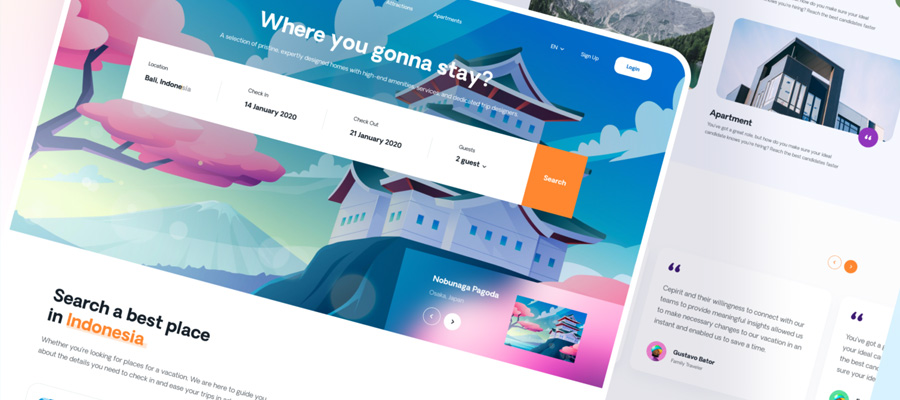
One general rule for good UX is to keep all information available within three clicks. No one wants to navigate down a complicated tree to find what they’re looking for. This is where a product page with selection criteria to narrow down the product directory is the better choice. Now they can look at all of the women’s or men’s sweaters and narrow it down by clicking selection boxes for sizes and colors, brands and price ranges.
Avoid putting search engines on your own website. People tend to regard that as a sign of the site being difficult to use. Instead, invest in better search engine optimization of product pages and individual business subdomains like your customer service department.
Do put site maps on your website, especially common landing pages, so that people can find what they are truly interested in. Consider putting “breadcrumbs” on your website to simplify navigation back to where they were. For example, you could have a row of images on the bottom of the page reflecting the last several items the customer looked at. Now they don’t have to look for their first choice item after looking at all the other options.
You Don’t Keep Them on the Right Pages
One of the worst things you can do on an ecommerce page is direct them to anywhere else other than the right product for them. For example, you should consider links to “bundles” that the buyer looking at a product would consider value-added. If someone lands on the product page for your older model, a link to the newer model’s product page is valuable. If they’re looking for replacement parts for the product, selling them the whole toolkit to make the repair is seen as a customer service. If your business is offering a service, your links need to funnel people to the page where they schedule service. You can improve your overall sales conversions via A/B testing of what links lead people to your intended destination as well as which page designs result in the highest conversion rate.
However, too many businesses see their homepage or latest content marketing piece as their ideal landing page. This results in people looking at a product page seeing links for content marketing for another product. Now they go read that, follow other links and abandon your page without buying anything.
A variation of this mistake is promoting social media on product pages. Don’t ask them to share the link to the product on their social media profiles while they’re considering buying it; it is too risky that they’ll get sucked up into the social media vortex and forget to buy from you. Instead, wait until after they’ve bought the item to suggest that they post on social media that they bought the item. Now you’re turning the converted customer into a word of mouth marketer on social media.
Yet another version of this problem is the blog that puts third-party ads on its site. Yes, you may make some money from the ads, but you’re losing business when people click those links and leave your site.
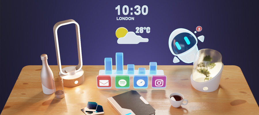
The Wrong Types of Interactive Content
Users will abandon your site as soon as it loads if they get Adobe or Java errors as your website tries to load antiquated interactive content. You’ll lose a lot of customers if you try to play useless generic marketing videos.
In contrast, clearly titled demonstration videos they must select to play improve conversion rates, since you aren’t sucking up their bandwidth with content they don’t want but have the content available when they need it. Small, difficult to read thumbnail images rarely make the sale, while large images of the product that they are buying will improve sales conversions. Where possible, show the product from several angles and demonstrate either its scale or its use. This helps ensure that customers are getting what they expect.
Provide lists of product features, as long as they are the features customers care about. Is it hypoallergenic or lacking common ingredients someone may be allergic to that your rivals typically include? Is it organic, locally sourced, vegan or vegetarian? What voltage does the product run at? How much power does it put out? How much does it weigh? How much does it cost? The ideal situation is a chart that allows someone to compare the product they are looking at against one or two other variations instead of trying to wade through a massive spreadsheet.
In short, insufficient information will cost you the sale if someone else makes it clear the product is water-proof or uses an ABC battery. Someone not able to tell that it meets these standards because of the sheer volume of information on the page is just as bad.
Setting up chat bots on a website to direct people to the right product or service is an increasingly common solution, but it doesn’t eliminate the need for trained humans altogether.

landing page by uixNinja
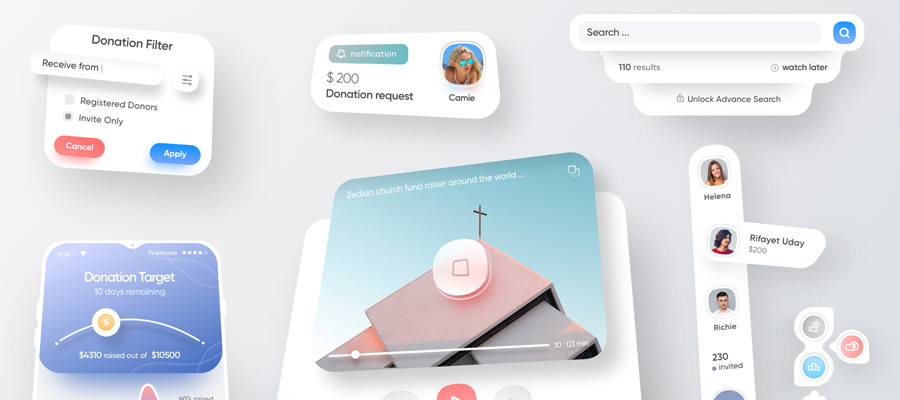
Overlooking the Need for a Customer Service Page
Your website is hurting your customer conversion rate when you lack a clear customer service page. A fair percentage of purchases are abandoned because someone has questions about the product that the frequently asked questions section doesn’t answer.
A motivated customer may try to buy despite issues with the payment system, but if they cannot get a hold of customer service when the payment system is erroring out, you’re losing their business as well as many others trying to buy from your site. If someone has problems with an order they’ve placed and doesn’t know how to get help, you’ll hear about it eventually in the form of bad reviews online echoed by others, hurting your online reputation. You can solve this problem by making it clear on several key pages how someone can reach customer services with questions, contact you if the product is defective, or reach technical service if they don’t know what to do.
Don’t forget to include support information in emails that you send to customers to confirm their orders and inform them of shipment of their order. This should be handled by your email marketing service, since these emails are a great way to build engagement with the customer and subtly continue to market to them.
An unusable user interface will cost you your customers before they even try to check out. If people cannot find what they are looking for, they will look for it somewhere else. If your website is taking people away from the product pages or service booking pages, your website design is costing you your business. Provide interactive content that answers the questions the customer needs answered. And make it clear how to reach customer services the right way when issues do occur.