When was the last time you updated your website? If you can’t even remember, you may have a problem.
Google receives an average of 3.5 billion searches each day. Can you imagine the possibilities? A percentage of those would probably be related to your field. Now, if only your website were optimized enough to be found. If only it were appealing enough for people to stay.
Alas, if your website is outdated, then it’s no good to you. People may not find any good reason to stay and see what you have to offer. The good news is, it’s never too late to do something about it. And 2017, halfway as it may be, is the best time to start.

How do you get them to savor every single piece of content on your website? Here are 12 surprising ways you can spruce up your website.
- Pique curiosity by adding a coming soon page and a countdown.
Worried about the time you’re going to spend updating your website? If you’re expecting your site to be down for a few days, that’s okay. This can be a great opportunity for you. Create a “coming soon” page. Feature a countdown timer. These are enough to make people curious and see what will be revealed.

You can use the same approach even if you have no plans of shutting down your site. You may be launching a new section or a new page. You can have a coming soon page for those as well.
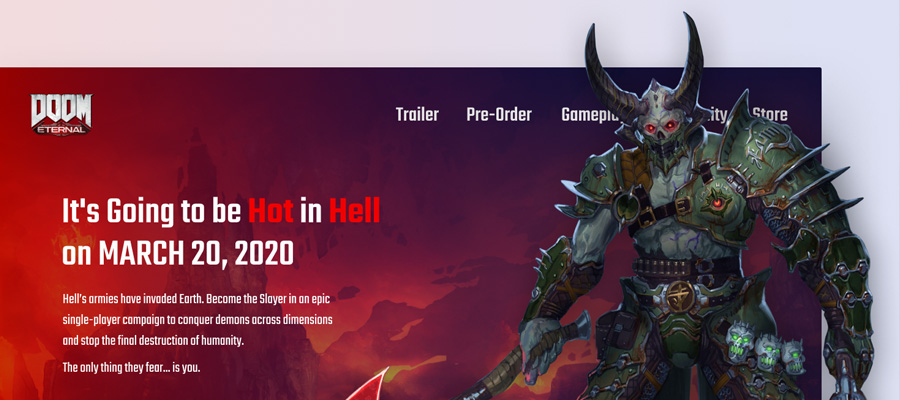
- Use a video background.
In the past, there was a lot of emphasis on the use of visual content. For websites, a beautiful, high-resolution image background is great. But using videos instead of stills is even better.
Research shows that by this year, 74% of web traffic will be in video format. And that’s not surprising at all! Consumers have been responding faster to video content. This, however, comes with a few precautions as well. Using background videos would mean doing it perfectly. Otherwise, it can turn people away instead of attracting them.

Make sure your background video is of high quality, but will not drag the performance of the page. Avoid excessive movements as well! The key word here is “background.” It’s supposed to support the overall appeal of the page, not distract people from the information that matters.
- Add a slider with Ken Burns effect.
Sliders can bring an interesting turn to any website. The smooth transition of images can turn a monotonous page into something with more depth. Add a more appealing touch to your page by using the Ken Burns effect on your slider images.
The Ken Burns effect involves adding depth to still images. This is done by zooming in, zooming out, or panning over the image. This will add some movement to still images. It’s like adding a slight video aspect, despite using stills.

To maximize the effect, make sure each movement is subtle. Vary the speed of movement to make the dimensions more enjoyable. Avoid hard transitions as well. Make sure each image seamlessly blends into another.
- Add buttons with background textures.
Buttons are helpful on any page. But just because they’re functional doesn’t mean they can be pretty. Adding background textures to buttons can make them even more appealing. It can turn them into something more than just a small part of any page.

And they aren’t even “small parts” of a page! If anything, buttons hold so much importance. Do you have a call-to-action? Your buttons will most likely lead them to perform that action.
- Try out a customized look for the login page.
The login page may seem like “just” a functional page. In reality, it has so many design opportunities. And when you grab these opportunities, you can make your site more attractive.

Try experimenting with different looks on your login page. You can align it with your brand’s overall motif or theme. You can also take the risk and change it up every so often. It all depends on who your audiences are. Think about what’s going to be most appealing to them, then use that.
- Try out a different look for your menu.
Menus are a must in any website. They help guide the way to where your audience wants to go. Again, this presents so many opportunities for creativity.

Yes, the usual menu lined up on top or at the sides have always worked. But just because they’ve always worked doesn’t mean there’s no room for change. Have you ever thought about creating them in a different form? Maybe try circular menus instead of the usual rectangular ones. The change won’t be interfering with your site’s functionality in any way. It can bring a different tone to how it looks overall, though. And THAT, my dear friends, can make all the difference.
- Add special effects to images.
Remember the earlier topic about the Ken Burns effect? If you’ve somehow looked it up, you’ll see the impact it has. From having a simple high-resolution image, you ended up with fantastic imagery. That’s what a simple zoom effect can do.
But you don’t have to confine yourself to this particular effect. You can play around! Experiment with your stock images. Make product images more interesting. Maybe you can start out with a blurred image. Then have that image come into focus. Or you can use the hand-drawn effect before turning it into an actual image.

It’s all up to you. Just make sure the art does not interfere with the message. If it distorts the words clarity, then it’s not worth it.
- Show cool hover effects.
Your website probably has menus or elements users can hover over. This action usually triggers something to happen. It can cause a menu to appear, for example. Or maybe it can enlarge an image.

You can apply different effects when people hover over a part of any page. For example, you can make some text appear when they hover over an image. This can add a mysterious and surprising look to any page.
- Captivate your audience with animation.
We’ve emphasized it over and over again. Still images are good, but the movement is better. If you’re hesitant about using videos, then animation can help you out.

If you have a talented animator or artist in your team, this can be a cool project. Some websites can leave the audience enthralled through animation. It does not just let them enjoy the movement. It also lets them have a deeper look at your approach. They can see your brand as fun, creative and imaginative. And to the right audience, these traits can make them say yes all the time.
- Add audio effects.
Just because people are mostly visual doesn’t mean you’ll let go of everything else. You probably watch TV shows and movies. And trust me, it’s not just the action sequences that leave you enthralled. The audio effects play a huge role. It’s those sudden bangs and changes in music. They make anything more engaging.
This is something you can use on your website. You can have a background music that suits your brand personality. You can also add different sound effects to different actions. Be creative! There’s a lot a little sound can do.
- Add a flip book rather than a traditional product catalog.
They say the print material is out. Brochures, catalogs, magazines – everything’s turned digital. But that doesn’t mean people don’t like the idea of turning pages any longer. If anything, bringing back the sensation of turning a page can be a great element to add to your website.
This is why you ought to try using flip books instead of the traditional online product catalog. It presents products in such a classic and familiar way. It’s something audiences won’t expect, but will appreciate. You can even add a few effects here and there. For example, you can have relevant images popping out as they browse from one page to another.
- Add a unique pricing table to show comparison.
A pricing page that details out every product or service is good. But allowing audiences to compare them all is even better.

Instead of only listing down your pricing options, create a pricing table. Have each package listed side by side. Show what one package has that the other doesn’t. This helps audiences look at what fits their budget while getting the features they need.
Don’t just look at your website as something that transitions you from traditional to digital. It’s so much more than just an online presence.
Your website defines who you are as a brand. It shows what kind of character and personality you have. It also delivers every piece of information right to your audience’s doorstep. Because of this, you have to make sure you go all out. Don’t wait for another year before making things happen. Spruce up your website now and expect amazing results after that.