We all need a good dose of infographics. Infographics is a hot trend these days. These are engaging, easy to understand and a perfect way to dissipate information. Varied, emotive and often surprising, infographics help us absorb facts and figures in the most effective way possible: visually. By taking statistical data that would normally be dry and otherwise lacking, and designing the information in such a way that it becomes not only more digestible, but also exciting and somewhat interactive. These graphics are excellent visual tools for explaining huge amounts of information where complex data needs to be explained immediately and clearly. It is a wonderful and appealing method to communicate data, facts, figures and statistics about a certain issue, instantly grabbing user’s interest with the graphical story board sort of presentation.
Infographic is one of the most challenging types of graphic design because the creation process alone is pretty intensive. Researching data is a very lengthy procedure of getting information that takes both your time and dedication for obtaining resourceful and correct data. After that, the designer must be able to create a strong visual impact that precisely displays the information in way that is rational and blend with the overall design. In modern terms, infographics are the visualizations or charts that are used to present a large amount of material to readers. This type of design is utilized to communicate information that would be impossible or too time-consuming to be explained solely by text or series of illustrations.
Inspired by these I have put together a classic collection that will mesmerize you. Here’s a collection of 50 infographics that are creatively designed, colorful, lively, shocking and educational. Go on, grab a cup of coffe and dive into this collection of infographic resources.
Women in Business. This infographic shows some positive numbers around salaries and GMAT numbers. I have a feeling that women will continue to move towards men in salary, position, and authority.
Disney vs Marvel. A collage assignment made by Curseofthemoon. An infographic about Disney buying Marvel. (via Curse of the Moon)

The Big Questions of Climate Change. The true impact of climate change (via Adolfo Arranz)

On Words. An alphabetical list of the most frequently occurring words in a book, excluding common words such as “of” and “it.” (via Amun Levy)

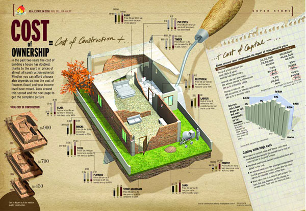
Cost of Ownership. The estimated cost of constructing a house. (via Digital Monkey)

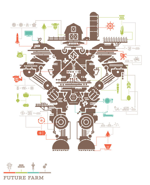
The Future Farm. a clever perspective at corporate farming (via Posterous)

Geological Time Spiral. A diagram of geological time scale. (viaEthan Hein)

Pikes Peak Course. A beautiful illustration for the Pikes Peak International Hill Climb (via Davvi Chrzastek)

Ancient Hebrew Cosmology. The ancient hebrew conception of the universe (via Michæl Paukner)

50 Years of Space Exploration. A huge infograph that show the last 50 years of space exploration. This incredible infographic was created by Sean McNaughton and Samuel Velasco for National Geographic. (via Sean McNaughton and Samuel Velasco)

Grand Mosque. This is an infographic press release that came from the Gulf News (Dubai). it came with the actual graphic and an explanation about the architecture of the great mosque. (via Douglas Okasaki)

High Rise. Out of the 191 countries that are counted by the United Nations only 81 (42%) to have a building that is higher than 100 meter. (via Theo Deutinger, Johannes Pointl, Beatriz Ramo)

Relief Wells & Subsea Containment. BP intends to drill two wells designed to intersect the original wellbore above the oil reservoir. (via Hollywoodbackstage)

If you are planning on getting engaged or are already engaged, this Marriage Proposal Guide is for you. Read on to get the facts on planning a proposal, buying an engagement ring, and popping the question. Ladies – here is your chance to drop a good “hint”. Men – start reading! (author: Richard F Sands - creator and owner of a good infographics site: Brilliance.com)
Genes and Society: Cloning. This informative infographic can help you learn to distinguish between research cloning and reproductive cloning. (via DNAPolicy)

Flickr User Model. Bryce Glass has developed a wonderful Flickr user model diagrams where one can simply understand the Flickr ecosystem. (via Bryce Glass)

Burning Fuel: The Average Car vs. The Average Human. An infographic comparison on how cars use gas to power themselves, just as people use food. (via Good)

Choose Your Weapon: The Global Arm Trade. World military spending has now reached one trillion dollars. (via Princeton)

Crude Awakening. The impact of oil spill in the gulf of Mexico (via Infographicworld)

Most Targeted Books. Every year, libraries are asked to remove books from their shelves, because they are found to be inappropriate. But the list of the 10 most challenged books in 2009 does show which books some parents find objectionable, and why they feel their kids shouldn’t be reading them. (via Good)

Red Tape: The Government Grind. US government average salaries and positions illustrated (via Princeton)

Twitter Users Profile. The different types of twitter users (via Infographics showcase)

Goodbye, Lenin. This well-made infographic is a 2nd-place winner of the international NewspaperDesigning contest. (via Lech Mazurczyk)

The Kulula Airlines. African airline Kulula undergo an entire fleet redesign. They made one big infographic on the exterior of their aircrafts. (via Shanairpic)

CarLand: A Century of Motoring in America. US automobile history. (viaGood)

Battle of the Plastic: Debit Vs Credit. A breakdown between a debit card and a credit card. (viaLoans and Credit)

Tallest Buildings. Here’s a look of the world’s tallest buildings. (viaJoelertola)

The Pyramid of Internet Piracy. MPAA provides a visual explanation with the pyramid of online piracy. (viaNIXON*NOW)

Digg Frontpage: Infographic vs Non-Infographic. Popular digg submissions that uses infographics against non-infographics. (via10e20)

The Slowest Loading Websites in the Fortune 500. This infograph details the load times of all Fortune 500 companies (via Heinley)

The American Dream. This infographic depicts the true American dream (via Spidercam)

No More Fish In The Sea . This infographic show the looming eradication of marine life would be the result of a lack of diversity in ocean ecosystems that comes from the overfishing of particular types of fish. (via Good)

Celebrity Body Insurance. List of some popular celebrity and the body part they insured (via Infographics Blog)

Glass Half Empty: The Coming Water Wars. This infographic explain why we need to save water now. (via Princeton)

Bicentenary Timeline . Illustration and Design for Fernández Editores (via Icarograf)

The Killing of Puerto Hurraco. Infographic made for the Spain of Democracy (via Julian Develascot)

This is Where We Live. Take a look at America by the numbers with this interactive infographic. (via Time)

Map of USA. Visualizing a USA map (via MakemyMood)

Six Seasons of ABC’s ‘Lost’ – By the Numbers. Funny stuffs about the American live-action television series. (via MediaFreakBlog)

Pyramid of Capitalist System. Capitalist explained on this simple but visually appealing infographic. (via NEDELJKOVICH, BRASHICH and KUMARICH)

LEGO Brick Timeline: 50 Years of Building Frenzy. LEGO, through the years (via Jesus Diaz)

Humans vs Animals. This interesting infographic show that some purely human traits are found on animals. (via Metrobest)

Why do Freeways Come to a Stop. This cool infographic provides 4 reasons on why do freeways come to stop. (via Infographics showcase)

The Giant Panda. A creative infographic displaying a portrait of panda through typography. (via Lish-55)

Transito 3 final . Infographic about what causes more traffic accidents (via Gerson Mora)

The Biggest Shift. Assuming these statistics are logically accurate , it highlight the significance and magnitude of social media. (via Derri Hasmi)

The Descent into Credit Card Debt. Mint.com has a funny, but educational, infographic about just how easy it is to become plagued by credit card debt. (via Mint)

The Infographic of Infographics: How Infographics are Made Infographics are so popular now that there’s a very meta infographic… on infographics. Check out this image by Ivan Cash for some statistics on their design and content.


Comments