Text is a source of information. In order to attract the attention of readers and highlight the material, it is important the words are beautifully designed and easy to read. The science of laying out fonts, combining them, choosing styles and sizes is called typography. UX/UI designers and professional UI design agencies have to apply it every day since it helps them to make websites and applications look more attractive. But how exactly do they do it? Let’s find out.
A Couple More Words About Typography
Before computers, typographic rules were used to create books, newspapers, and posters. Now they are used to display information in programs and on websites conveniently.

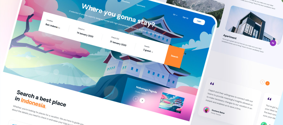
A•LAB Design studio website by Mike
Typography rules take into account font parameters, text size, and word location. To make the text easy to read, you need to know which fonts to use, what the style is, and what the proportions between the main text and title should be.
How to Choose Fonts
The appearance and usability of digital products depend on which fonts are used. The right font helps your users find what they need faster. Usually, when a user visits a page, they cast a glance at the text and immediately perceive the information they were looking for.
However, if an unusual font or display is used, the text becomes more difficult to read. Most likely, anyone who visits the site will not waste time parsing the text and end up closing the page.
To decide which font to choose for a site, you need to know about which family, typeface, and classification to choose from.
Font Classification
Fonts differ in character, appearance, and style. Some of them are static while some transmit dynamics. But such minute differences are only seen easily by a person with knowledge of typography - the everyday web users, most likely, will not notice any difference.
The main visual difference between fonts rests on the serifs of the letters. This parameter is called font classification. On most websites, two classifications are most frequently found: Antiqua and Grotesque.
- Antiqua is a serif font. Therefore, “serif” is often included in the font’s name. One popular Antiqua is Times New Roman. It conveys a sense of reliability and tradition. Serif fonts look strict and classic. They are used in paper books, magazines, and print media. Longer texts in this font are easy to read.
- Grotesque - sans-serif font classification. The word sans (“without”) is often found in its name—popular grotesque fonts: Arial, Calibri. Grotesque is associated with something modern and light. It is often used in drawings and technical documentation, in program interfaces, and on websites.
What Is a Headset?
When talking about fonts, there is also something called a headset. By this name, we understand the same font family, which consists of different styles—for example, Montserrat. The usual style is Regular, the rest of the styles depend on the type of font, and the reason it was created. They differ from each other in slope, proportions, and thickness, but have the same character.
How to categorize fonts? Here are some parameters that UX/UI designers usually use make distinctions:
- Thickness. Can be Light, Regular, Bold
- Inclination. Direct or Italic
- Width. Narrow, Normal, Wide
- Size
Select Font Sizes
Font size is selected for each site individually. The main thing is to ensure that reading text on the page is always comfortable. However, if you design a mobile application, you should take into consideration popular screen sizes and guidelines of native development for iOS.
While the font size of the main body depends on the screen size, you should also think of headings and other details. There are important proportions to respect:
- Properly sized headings help create contrast with the body text on the page. For the calculation, the coefficient of the golden ratio is 1.6.
- To determine the size of the headings, the size of the main text is multiplied by 1.6.
Calculate which font size on the site is better with the calculator. Based on the parameters of the regular font, it selects the optimal sizes for headers. Following these rules, you will be able to design products that will be easy to use and loved by your clients.
Font Combination
Using different fonts on the site helps create contrast and sets the mood while reading text. Therefore, designers carefully select the fonts for the site and analyze different combinations. There are no specific algorithms for choosing font combinations because each project is unique.

Collibra Brand Guidelines by Melissa Miyamoto-Mills
Usually, designers combine either different styles of the same font or two fonts from different classifications. The combination of Antiqua and Grotesque helps to show the hierarchy of the text and is easily readable.
Conclusion
In layman’s terms, typography is the elegant organization of fonts. The basics of this science are the correct selection of fonts, the location of letters in a specially designated place, and font size.
Every experienced designer knows that typography plays an important role in UX/UI design because it is simultaneously considered an art and a means of transmitting the information. Therefore in this artform, every word has its meaning. In order for messages to be conveyed to visitors with impeccable efficiency, it’s crucial to develop attractive and user-friendly designs.


