How to use text to create a great artwork.
Not so long ago, typography was an art confined to a restricted group of scholars who worked on the old type foundries, demanding specific knowledge to understand its complex design procedures and a high artistic sensibility to capture the subtle way of how the letter and its spaces interact. In addition, it required from the typographer not only special skills in the handling of different fonts, sizes and text boxes, but also great patience and dedication, once the arduous process of making a piece took days, even weeks.
Only with the evolution of new technologies the work became more democratic. The computer – particularly the advent of software – enhanced all the working instruments developed by men, making them more dynamic, practical and accessible. Mankind contemplated a huge turn of events in the operating methods of every single profession, giving to the technical-scientific knowledge the hard task of managing an almost endless array of tools to develop a wide variety of projects. Some radical specialists like to classify this technological effervescence as the Third Industrial Revolution. Other, less enthusiastic, affirm that these events are nothing but a natural consequence of the wave of innovation that characterized the 20th century. Whatever the verdict is, both sides agree on one point: revolution is a term that fits perfectly to the field of graphic design.
We are a lucky generation. Nowadays, any amateur is able to create a good piece. The flexibility of computer has helped graphic design to become multipurpose, fast and highly effective. Within this new advantage, typography protested with all of its strength, renewed by a voracious generation of young designers who are creating a new paradigm of artistic expression. Playing with type has now become the fashion. The goal of this tutorial is to help you creating a consistent piece entirely based on typography. Learn some basic techniques to get harmonious layouts and improve your composition skills.
01. Choose a theme
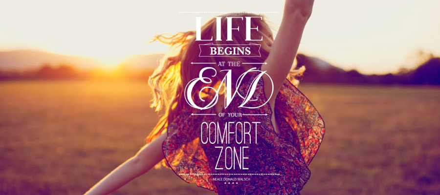
Before developing any piece, you got to have a theme in your mind. What do you want to communicate? What ideas you want to expose? Which sensations you want to transmit? Having these goals defined, creativity occurs more easily, speeding up the entire work flow. A picture is worth a thousand words. A good idea is worth a thousand awful pieces. The goal of Typography was to show a composition study without telling anything by words. That's why the whole piece is messy and purposely meaningless.
02. Define composition structure
Every good piece is planned before made. Some of the solutions appear during the implementation, but most of them must be drafted even before you open a window in the program. Use the paper and the pencil rather than the screen and the mouse. Sketch the biggest amount of ideas, shapes and elements that comes to your mind. Try patterns that make your layout harmonious, always imagining its possible results. As a guide, draw from two to three lines that will sustain the whole composition. Arrange them in various ways: crossing, interlacing, putting in parallel etc. Imagine yourself alocating the elements, filling gaps and valuing spaces. Since we are working with typography, these spaces will be filled with types and text boxes. Draw at least ten possible variations of these guide lines on a piece of paper, and then put them side by side. Trust in your artistic intuition and choose the one that best suits you.

03. Color palette
This step deserves a special attention. A good first impression only happens when you choose your palette carefully. The way you spread it though the artwork is what will define its beauty (or its ugliness). There are certainly hundreds of beautiful achromatic artworks, but for our study, we are assuming the use of color as a tool to make your piece more attractive. To get a nice palette, try to use a color wheel. There are many ways of extracting good combinations from it. Parallel colors express a certain mood, inverse colors are complementary and so forth.

04. Fill your artwork
Only now the true work begins. The dashed lines are now useful for guiding the whole composition. In the example, they divide the canvas in at least three asymmetric spaces that can be placed between empty and full. Enjoy the variety of colors you selected previously and keep yourself limited to those colors in order to create some consistency. Try to always use colors that matches and avoid visual redundancies. Be creative when filling the empty spaces. Resize the types in different ways, overlay it, make new shapes and text boxes. Use your imagination and don't be afraid of failing! The computer gave us all the incredible ability of going back on earlier steps if you eventually did something wrong ([ctrl]+[z]/[cmd]+[z]).

05. Text column
In the example, I wrote random words and stacked them in column. And then I grouped them in a folder (by selecting them all and pressing [ctrl]+[g]/[cmd]+[g]), merged it ([ctrl]+[e]/[cmd]+[e]) and inverted the whole set in order to purposely disturb readability.

06. Retro type
The stylized [P] was made from strokes with equal thickness and disposed in parallel, each using a color from the palette selected previously. To make it in Photoshop, open a new window ([ctrl]+[n]/[cmd]+[n]) and activate the grid by pressing [ctrl]+[']/[cmd]+[']. Press ctrl+r/cmd+r to activate the ruler. If you wish to make more accurate guide lines, click on the ruler, hold the button and drag the line to where you want. Repeat the process until you get a custom grid. Select the shape tool, hold the shift button and make a symmetric circle. Duplicate the layer for that circle, change its color and reduce its size to two modules of the grid. Make this step once again, again changing its color. The overlapping layers give the impression of symmetrical strokes. Repeat the task until you have five different of those (the last circle should be white). Now go to the layer window, select them all and group ([ctrl]+[g]/[cmd]+[g]). Duplicate the group (right-click on it>duplicate group) and merge it ([ctrl]+[e]/[cmd]+[e]). Hide the preview of the assembly folder by clicking in the eye icon. Keep it hidden. If you make a mistake, you can go back to it. From now on, we will work with the merged layer only. Select the marquee tool and draw a horizontal rectangle in a very narrow section of the circle. Press [ctrl]+[j]/[cmd]+[j] to create a new layer from this selection. Press [ctrl]+[t]/[cmd]+[t] to resize this new shape and increase it's lenght. After that, go to the layer window and select the layer below (the one from the circle). Select the marquee tool and dash rectangle in the lower left quadrant. Activate the grid ([ctrl]+[']/[cmd]+[']) to use it as guide. Delete the part you selected. Once again, select a small section of the strokes, duplicate it, and increase its length until it touches the other side.

07. Sources
The art was largely made by cutting and pasting. Gather the biggest amount of journals, articles, newspapers as possible. Scan them, cut out parts of their sections and fill in the gaps in ways you find interesting.

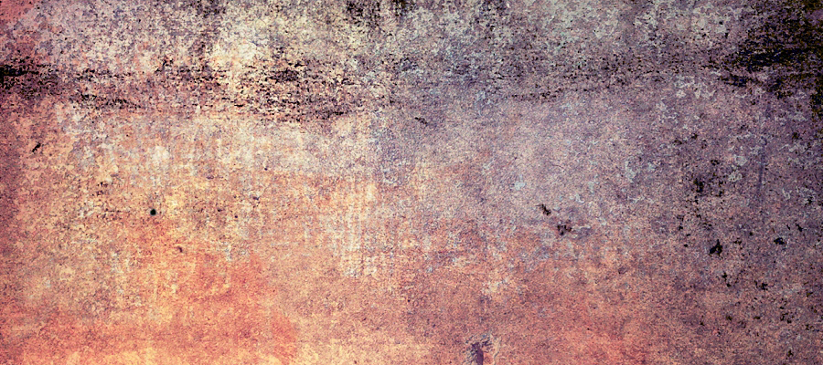
08. Texture
For the texture, I scanned an old piece of paper em 600 dpi. With some curves and level adjustments, I improved the contrast and saturation. Then, I created a radial lightening spot though the lightening effects filter (filter>render>lightening effects) to make it more elegant. Finally, I applied it over the whole artwork and set the blending mode to multiply.

09. Reminder!
Professional typography is very different from typography as an artistic expression. The empty spaces must be valued, the writing process is strictly based on grids and the choice of typefaces are carefully made. And that's how it should be.
Because the goal of typography is not to create artworks, but to make information clear, concise and beautiful.

Final considerations
Now you are ready to launch your artwork. Ask friends their opinion, post it in your blog. The goal now is showing the world your talent. Good luck!