According to MarketingCharts.com, 75% of grocery shoppers make their purchasing decisions in-store, meaning that only 1 in 4 people decide upon the exact product they’re going to buy – and stick to it – before they head to the store.
Now, you might be thinking, “I’m a graphic designer, not a marketer, why does this matter to me?”. Well, if you’ve been given the task of designing a food product label for a client, this statistic is something you need to keep in mind, as it completely changes the approach you’ll need to take when starting the design process.
Because 75% of people are making their purchasing decisions in-store, it means that for 3 out of 4 people, their purchase decision will come almost solely down to the way the product is labelled and presented. Therefore, you need to keep marketing principles in mind when designing the label.
Here’s a fool proof three-step process to follow when designing any food label:
Step One: Get the Customers Attention
No matter who you’re designing a food label for, it’s highly likely that once the product goes on sale, your design will be sitting amongst a sea of competition (especially if it’s being sold in supermarkets).
Here’s a typical supermarket shelf, to illustrate this point:

Therefore, the first – and most important – part of the process is to design a label that grabs the initial attention of the target consumer.
There are a couple of design tricks you can use to do this:
Firstly, you need to use colour wisely, which means basing your choice of colour(s) predominantly on the competition, rather than simply a colour that you feel “looks nice”. You need to choose colours that are likely to stand out when sitting on the supermarket shelf, so make sure to look what the competition is doing, and to use colours that differ greatly.
For example, if you notice a lot of competitors using red and yellow (as seems to be the case with the shelf full of tinned produce pictured above), you should most likely steer well clear of these colours, if you can.
Secondly, you need to be smart with typography and font sizing. If you look at the image above, it’s likely that the “Big soup” label is the one that initially stands out in terms of typography; this is because it’s big, bold and eye-catching.
Of course, there are other things you can do, but the bottom-line is to ensure that it stands out as much as humanly possible.
Step Two: Clearly Communicate the USP (and Brand Values)
OK, so you’ve got the customers attention and they’ve most likely picked up the product for further analysis.
At this stage, the consumer is looking for validation that the product – and brand – is right for them, so you need to make sure that your design clearly demonstrates not only the USP of the product, but also the values of the brand behind it.
Innocent Smoothies (pictured below) is a brand that does this extremely well:

Innocent Smoothies main USP is purity; their products are 100% fruit with no additives, preservatives, nothing.
The minimalistic nature of their product labelling is essentially a visual representation of this USP. All focus is on the product itself, and the simplicity of the label design serves to represent that of the product itself.
You’ll also notice that the flavour (e.g. kiwis, apples & limes) is one of the most prominent aspects of the label design; this is intentional, as their brand is focussed on the ingredients and nothing else.
Because the label communicates the USP and brand values so clearly, it’s easy for the consumer to think “this product is right for me”, and proceed to purchase the product.
Step Three: Showcase the Product
It’s easy for us designers to get “carried away” when it comes to graphic design, but it’s important to remember that with food and beverage products, the product itself can often be the best selling point, so the label should serve to highlight that.
There’s two ways of doing this:
The first option is to simply ensure that the label isn’t so large or obnoxious that it gets in the way of the actual product. This is typically the best option if you’re designing a label for a product that is visually stunning in itself, as is the case with the aforementioned Innocent Smoothies (which are all brightly coloured and naturally eye-catching).
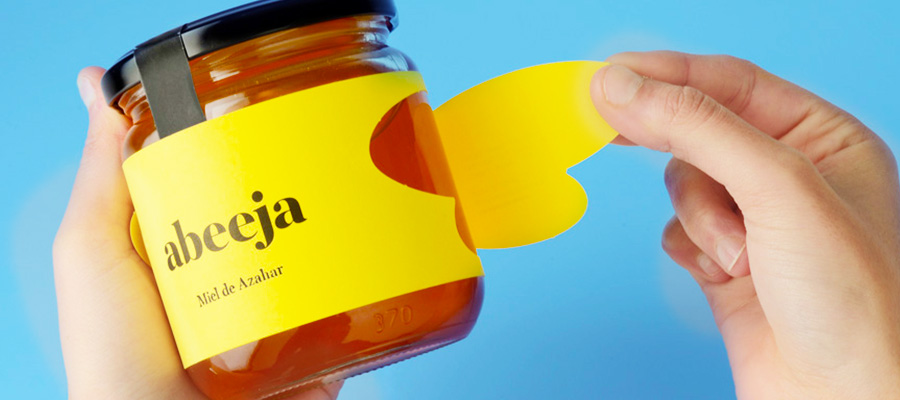
Note: If you do need a large label but still wish to showcase the actual product itself, you can use clear adhesive labels (you can get adhesive labels from fastlabels and any other speciality label printing company).
The second option is to utilise photography and/or imagery of the product on the food label. Many food brands do this; here’s an example:

You can see that all four brands of baked beans feature a photo of the product itself on the product label. This is the best option if your packaging is restrictive (such as a tin can).