Want to elevate your design skills and create visually stunning posters? This comprehensive Photoshop tutorial reveals advanced techniques to help you achieve professional-level results, by gradually practice. From gradient backgrounds to glowing effects, splatter brushes, and dynamic typography, this step-by-step guide walks you through the creative process. Perfect for designers looking to experiment with unique effects, this tutorial is packed with tips to enhance your projects and show your artistic potential.
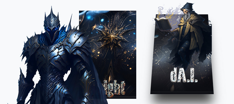
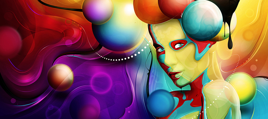
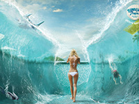
This is what we are going to create:

We recommend our easy-to-follow tutorial that combines different secret Photoshop techniques to create a colorful poster with an old-school vibe (tutorial updated).
It also shows you the effectiveness of Photoshop brushes and blend modes, and how you can use them to greatly improve artworks. It finishes with a nice composition and some useful tips you can use in your design projects. The techniques involved in this tutorial are not complicated.
Step 01
First we’re going to open a new document with dimensions:

Let's create the background. Click the little black and white circle that’s at the bottom of the layers palette and select “Gradient” like the picture below:

Make sure the dialogue box looks like this:

Then select the rectangle next to the word “Gradient” and insert the following settings:

This is what we should now have:

Now we’re going to add some glows to make the background look a little more unique than just a gradient. Grab the brush tool and select a circular brush with a hardness of 0% and a foreground color of #ccffff. Create a new layer above the background layer and click once in the middle of the background image. Set this layer's opacity around 60%.

Step 02
Make a new layer, download the Splatter Brushes, and use them like in the picture below. The color I've used is #77e5e4


Duplicate that layer and then select the bottom one. With my favorite filter, Gaussian Blur, I blurred the bottom splat layer about 3px (at 72 dpi, blur radius will be higher for higher res images) and set the layer mode to Color Dodge.

Now go to the top splat layer (with NO blur), set the blend mode to the Linear Dodge.

You can try different colors for the splats and other little details and do the same blur and layer modes as above to achieve this glowing effect. The pink I used here is #e577d2

The gradient fade to dark in the background helps to create the illusion that these pieces really are glowing.
Step 03
Now we’re going to add some typography. Go to download the Angelic War FontAngelic War Font that we’ll be using. Select the text tool and type “design” (or whatever you want your composition to say).

Click the “design” layer in the layers palette and select the little fx in the bottom of the layers palette and click “Drop Shadow.” Enter the following settings:

Then select the checkbox next to “gradient overlay” and add the following settings:

The colors of the gradient are #1b2f2f on the left, and on the right is #231d1d

You should have something like this:

Step 04
Save the file you created, in whatever format you want, preferably .psd (Photoshop format).
Download the free Photoshop Actions Set from this DeviantART page.

Experiment with these to get different color results: when you’ve found one you like, you’ve finished.
This is the result that I like the most:

Step 05
We are going to add some lighting to our composition, so go to Filter > Render > Lighting Effects and select the options like in the image below. Play about with the angling settings until you get something that you like.


Now go to Filter > Render > Lens Flare and select the options like in the image below. Play about with the angling settings until you get something that you like.


Apply the Lighting Effect again.


Let's add some extra effects, the lighting dots. Go to Filter > Render > Lens Flare.


Step 06
Let's apply some texture to our composition.
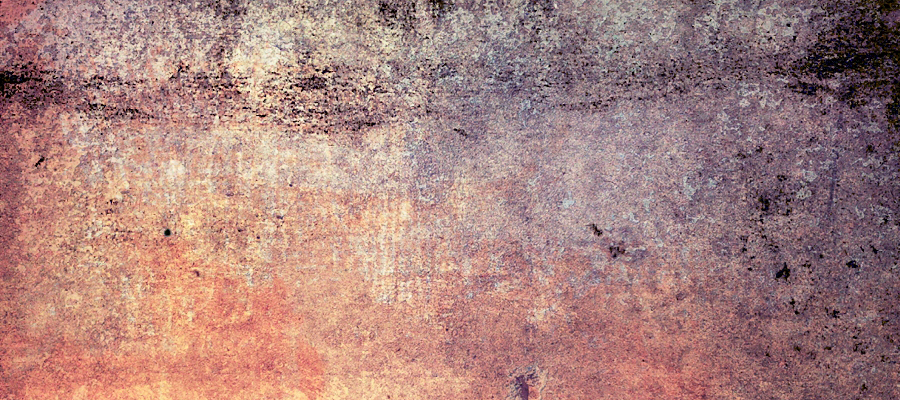
Download the "60+ Vintage Style Textures Every Designer Should Have" Pack and select whatever texture you like, or use my texture from below (click on the picture to download the full resolution picture).

Put the texture on top of the poster, and set the Blend Mode to Overlay and the Opacity to 75%.

The Final Result:
So here we are folks. I hope you can successfully apply these effects to your own composition.

Study the Photoshop File
Hopefully you will find something in the tutorial useful. Remember, the only limit is your imagination, so don’t hold back.
Start transforming your ideas into captivating designs today with these Photoshop secrets!