We will learn how to create this beautiful slow shutter text effect in this Photoshop tutorial.

Ok, firstly you need to create a new document at whatever size you wish to work at. I have used 1920 x 1200 because thats the size of my screen. You do this by pressing Cmd + N, unless your going to print the final piece then use RGB as it gives you a broader range of colours to work with. If your printing, then use CMYK. I also like to work using 16bit colour or above, it makes your gradients look much smoother.
Once your workspace is setup you will need to apply a base gradient (1. + 2.) Select the gradient tool by holding the mouse button down on the fill tool, then double click the gradient just below the menu bar. You now have the opportunity to create a custom gradient. Experiment by adding in different colours (click just below gradient bar & click color to change it) and moving them around (drag colour pointer left and right)
Once your happy click OK. Drag your gradient line whilst holding Shift to make sure you get an even gradient. If your not happy then try again, just hit Cmd + Shift + Z.
Now you have a good base it’s time to create the path. This will eventually be the text itself so you need to try and be as artistic as possible. Having some knowledge of paths will help quite a lot so to complement this tutorial nicely we have created a really easy to follow Paths tutorial, click here to read it now.

Create your new layer and select the Pen Tool (1.) and select the options below the menu bar as shown in the diagram. Now all you have to do is draw and drag (2.) your points until you have a flowing piece of text or some other dynamic shape, a smooth curvy line works best.
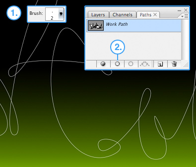
Now you need to stroke your line with a fine white brush. Select the brush tool and set the size to 2px (1.) Now click the paths tab in the layers menu and then click the Brush button (2.) This will stroke your line with white which represents the lights source and it’s brightest part.
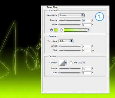
To create a realistic outer glow don’t use the default settings! Right click on your new layer and select blending options, then select the outer glow option which will give you the menu shown in the diagram (1.) Now adjust the settings so they match the ones in the diagram. If your using a different overall colour then select once close to it, I have used a slightly lighter green than the background.
You now have a decent glowing path. The next part of the tutorial explains how to customize the whole image and make it unique so don’t feel limited by what you do next, it’s all about experimenting! There are lots of uses for this effect such as simulating moving lights in photo’s, creating cool masked animated light in flash, or just creating illustrations. We are creating a static wallpaper so if your ready, lets continue…

Firstly, we are going to enhance the background layer with some more simulated light. Do this by selecting a nice complementary colour in it’s brightest shade (1.) and a big 300px brush. The rest is up to you, but I recommend working on a fresh layer as this gives you the flexibility to build up a few colours. It also helps if you don’t like how its going, a bigger brush sometimes helps.
Once your happy with the background you will probably want to add some depth by copying your original linework. Do this by dragging the glowing line layer onto the new layer button in the layers menu twice (1.) This will look like to much at first but the next stage will really improve the image.
Go to the menu and click Filter > Blur > Guassian Blur and apply about a strength 5 blur. With this layer selected slightly rotate it using Cmd + T and you may want to distort it by holding Cmd and dragging a corner when the transform handles appear.
To add a really dynamic moving effect get your second duplicated layer and apply a radial blur to it. Do this by going to the menu and clicking Filter > Blur > Radial blur. Playing with different strengths will help you get the look thats right for your image. Its fairly strong on my piece hence the very opaque look. Less strength will create a more ‘ vibrational ‘ effect.
Finally I have added a few ways of making your artwork even more distinctive. The possibilities are endless but here’s what I’ve done.

Another new glowing text layer with a red glow has been added to bring in some contrast. In order to stop it overriding the main text I have used the eraser on the line crossovers.
To bring out the line connections I have used the dodge tool on a 50% strength. This can be found by holding down the mouse button on the 14th tool on the toolbar. Set it up like you would a brush and get creative. It sometimes works best if you flatten the entire image before you get started.
Finally, to add some adjustable contrast to the image I flattened the whole thing and copied it to another layer (like I did earlier with the path itself). Selecting the Overlay blending mode and adjusting it’s opacity will give you a ‘ deeper ‘ image.

