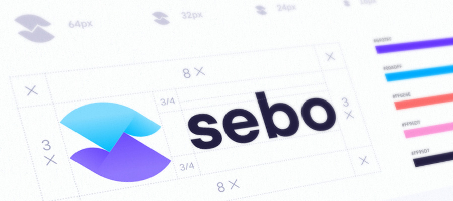
A good logo is original, appropriate, practical, beautiful, simple in its form and with the ability to convey the desired message. If you want to know how to get a professional logo for free, you should check some online free tools for this. Here we are going to discuss how to make a good logo?

Iterable Brand Assets by Ramotion
To achieve this there are five qualities that every logo must have:
- Simple
- Recordable
- Timeless
- Versatile
- Adequate
1. Simple
A simple design makes it easy to remember our logo and helps it to be versatile and memorable. A good logo is something exclusive that makes it unique.
Remember the KISS Principle (Keep It Simple, Stupid)
2. Recordable
Following closely the principle of simplicity is its ability to make it easy to remember. The design of an effective logo must be memorable, and this is achieved with simplicity. However, the logo must also be appropriate in what it represents.
To the surprise of many, the design of a logo is relatively unimportant, and even the adequacy of the content does not always play an important role.
This does not imply that optimization is not desirable. It simply indicates that a one-to-one relationship between a symbol and what it symbolizes is, very often, impossible to achieve and, under certain conditions, relative.
3. Timeless
A good logo must be timeless, that is, it will last with time and changes in Fashion. Will our logo be effective within 10, 20 or 50 years?
At this point, it is not about comparing with buying pants or a dress. In the case of corporate identities, longevity is the key. Do not follow the pack and you will get your product to stand out.
Probably the best example of a timeless logo is that of Coca-Cola ... if you compare it with the Pepsi logo, you can see how effective a timeless logo can be. See how the Coca Cola logo has hardly changed since 1885. This is a timeless design.
4. Versatile
An effective logo should allow us to use it in a wide variety of situations, media, and applications. The logo must be functional. For this reason, a logo must be designed in vector format, to ensure that it can be extended to any size. The logo should be useful in both horizontal and vertical formats.
A logo is still effective if:
- It looks good and is useful printed in a single color.
- It looks good and is useful printed to the size of a postage stamp.
- It looks good and is useful printed on something as big as a billboard.
- It looks good and is useful printed in negative.

Flyr – Brand Identity Design Guidelines by Ramotion
A good way to get a versatile logo is to start designing in black and white so we will focus on the concept and the form instead of the subjective nature of the color. We also have to remember the printing costs: the more colors we use, the more expensive it will be for the company in the long term.
In the design of logos, the Pantone color system is the most recommended.
5. Adequate
The elements that make up the logo must be appropriate for the purpose intended. Surely if we make a logo for a kindergarten, we will use a font that would not be appropriate for the logo of an Advisory.
It is also important to note that a logo does not have to show what the company sells or the services it offers, that is, a car company does not have to have a car as a logo. The Harley Davidson logo is not a motorcycle, nor is the Apple logo a computer. A logo is only for identification. Proof of this is that if we look at the 50 most important brands in the world, we will see that 94% of their logos do not describe what the company does.


