Whatever strategy of growth you choose, content is the king of everything. Any guide that you can find describing different marketing techniques, has a creation of compelling posts as a given fact. Otherwise, nothing will work, because even if you get Instagram likes in the easiest and cheapest way, your blog will still be drowning. And in the conditions, when it appears that all the possible topics are occupied, you may wonder, how to produce content that could help you compete with more experienced influencers, and make a difference within the industry. This is no easy task, but it is quite possible! In this article are gathered the most efficient tips and techniques for designing the greatest material for social media!
Use Colors To Attract And Retain Your Audience
Color is one of the main instruments for human visual perception. That’s why a good color scheme will definitely increase the quality of your designs on social networks like Instagram, YouTube, Facebook, etc. Many types of research throughout the years are proving that colors are a superior trigger for snap judgments, which lead to increased interest in your posts, such as likes, and in the case of brands - providing a better sales rate.
People love stylish and simple designs, so you can lose the intricate patterns and stuff if you have the right color picked as your prominent.

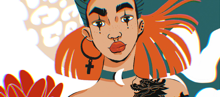
Social Media Post Design by Mahdy Hasan Hridoy
The reason for such an impact of colors on the reception of content is that colors are often bringing a certain pack of information built-in, thus creating a specific mood and triggering specific memories and personal associations. For example:
- Red - is a color of alert and passion, it is commonly known as the best color to turn the attention of people. That is why it is very often used in the retail industry and salesmen.
- Blue and navy - being cool colors, these are reminding of security and tranquility. Different shades of blue combined with white are the most popular decisions to demonstrate a professional and busy atmosphere, thus many consultants are using them in their online activities.
- Green - the color which represents nature, giving us a fresh and cheery vibe. Also symbolizes the connection with ecological activities, of course, so if you need to highlight something about ecology in your blog - be sure to put in some green motives.
Get Yourself A Signature Font
Calligraphy is also a good visual anchor for users of IG and YT. Possessing a specific font is excellent if you want to increase your recognition, visibility, engagement, following and get more likes. It can be one of the basic fonts that are offered by editing apps and programs, or it can be a completely original product, which you made yourself. Nowadays you can even hire an illustrator, who specializes in creating fonts and have something to stand out from everybody else in your niche. The main rule to stick to is that your font has to be easily readable, especially in small formats, because the majority of users are consuming content through smartphones, or tablets.

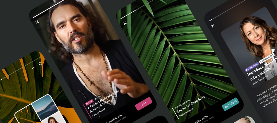
design by Gresa Mehmeti
Minimalism Is Your Friend, But Details Matter
Leave the over-contrasted, glittery images back. The 21st century is all about comfort and simplicity. The same works for the content. To embrace the most significant target group possible, you must aim for the most understandable posts. With a proper color scheme, you will not need to fill the blank spaces with unnecessary patterns. Today, the main trends to follow in your design are:
- Geometrical forms
- Mild and pastel colors
- Less defined contrast
- Mix of urbanistic culture and greenery
Modern principles of content-making can be compared to eclectic interior styles, like lofts. Basically - nowadays the loft concept is about mixing in some personalization on basic canvas. So your posts should be - it has to demonstrate something and give a viewer a personal hook that will connect them with your Instagram blog, for example, to get more likes. So, the next logical point to remember would be:
Attaching It To The Audience
The secret for making 100% sharable content is to give people the feeling of being involved. If your posts are clicking and liking with the experience and interests of your audience, you are doing it right. There are some methods to increase your connection with people who follow and like your social media blog and posts:
- Dilute your posts with non-related content, based on your personal experience or opinion about something
- Encourage your followers to share their thoughts with you in the comment section or private messages
- If you post your crafts, try to put in some history of the creation - it will pitch the value of your work
- Explain your ideas and emotions, so users will associate themselves with you.
Communication Is A Must
Whatever good is the quality of your visuals, to make your content on Instagram, Facebook, Twitter, Tumble shareable as hell, you must talk with your followers. Good terms of relationship with your audience are what improves your rates significantly, and motivates people to share and like your posts. Here are a few tips to maintain a fruitful and pleasant communication with your subscribers:
- Be friendly and polite.
- Show your gratitude and demonstrate appreciation for each follower.
- Encourage user-generated content (also a fine extension to your material plan - see #drawthisinyourstyle on Instagram).
- Ask questions and offer ideas for small-talk in your comments.
- Do not let any trolling and hatred spread in your profile. Objective criticism is good, but it is usually easily distinguished from useless trolling.
Learn All The Time
To acquire a true mastery for creating social media content, it is worth taking classes, as long as your budget allows you. At least, you will get a fair understanding of the basic skills you need and will get directions for your research. Trends are living a very short life, and to keep up your rates, increase likes on social platforms you simply must be fluent in SMM.

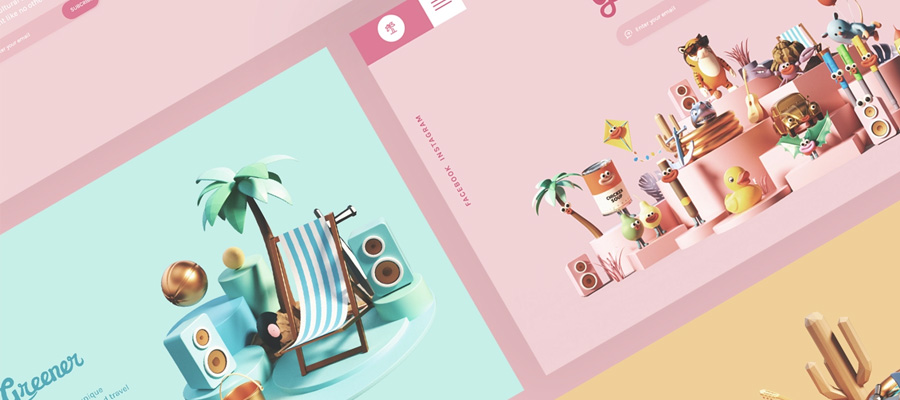
design by Janna Hagan
Also, some photography workshops can assist you to improve the quality of your visuals, which is definitely a plus. Of course, you should also revise your qualification and knowledge of the subject you embrace so you will not drop out of the fresh flow. Be sure - your competitors are lurking in search of the newest trends as well. And having some theoretical knowledge of SMM will be a sure help for you to filter and use the information you receive.
Optional. Get A Better Gear
Modern mobile devices provide a decent quality of photos. But in order to improve the perception of your content on Instagram, Twitter, Facebook, etc, you should gear up. Of course, if your budget allows.
Sometimes, buying a full version of the editing app will do. But to create a more professional and powerful look for your profile, it is worth buying special tech, especially in case if you present your crafts - professional or semi-professional cameras still catch details better than the latest smartphones do. One of your best deals for any type of camera would be a tripod. This thing does miracles for sure.
Illustrators can also expand their business by buying mini-printers and cutters, which allow them to produce merchandise at home. If one has a somewhat strong fanbase and get tons of likes, this investment will be successful.
Work On The Visual Balance
To gain the attention of users on any platform, you have to make sure your whole profile is striking like lightning. When people enter your profile, they will get a general impression of your posts. And if it is not balanced well, users will get a sense that your content-making style is sloppy. So, to avoid this mistake, you should hold on to some ground rules for creating a share-worthy profile, which can collect likes and other engagement:
- Stick to a limited choice of filters and presets
- Pay regard to the “air” in your pictures - having some free space in-between is good for creating a lighter and pleasant atmosphere
- Develop unified designs for your content
Conclusion
To make compelling content, you have to do a lot of organizational work and maintain your working rhythm all the time steady. And then you begin improving your visuals, step by step becoming a better version of yourself. Keeping in mind some tips from the text above will help you to crack this process easily.


