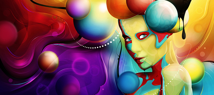
 Today I'll walk you through the creative process of making a abstract female composition by applying some cool halftone and 3D displacement effects. For this tutorial you need basic Photoshop knowledgeable, as we will work with basic Photoshop tools, like burn tool, brushes, filters and others. The main focus of this tutorial is to explore Photoshop's often-misunderstood Displace Filter and how it can be utilized to re-create a popular style of illustration. The end effect is quite stunning and hopefully you’ll pick up some tips you didn’t know before. As you can see from the preview, with the basic knowledge and a little effort, we will be able to create a stunning effect. So, lets start to work.
Tutorial Details
- Program: Adobe Photoshop
- Difficulty: Advanced
- Estimated Completion Time: 8 Hours

Tutorial Assets
You'll find some files in the "source" folder. You'll also need the following stock images and fonts to complete this tutorial.
- Texture pack one
- Texture pack two
- The medium-sized version of this model
- Wireframe pack
- Shattered 3D font
- LOT font
A Brief Breakdown
Here's a quick summary of how the final image was created. I usually begin by layering multiple textures with different Blending Modes to produce an interesting background (A). The next stage is to add the main focal point – in this case the model (B), then apply the halftone effects. I then used 3D renders to displace several duplicate model layers, which were also masked to create the abstract fragments (C and D).

Making your own brushes can be both fun and rewarding. The brushes used in this project were created by applying cellulose car spray and water-based poster paint onto cartridge paper. I also experimented using the same technique on paper that had been soaked in water, which gave an interesting marbling effect.

Step 1
Press D on your keyboard to reset the foreground / background colors to black and white, then press X to swap them, so black becomes the background color. Create a new RGB canvas 21 cm x 27.7 cm and choose Background Color from the Background Contents drop-down menu.

Step 2
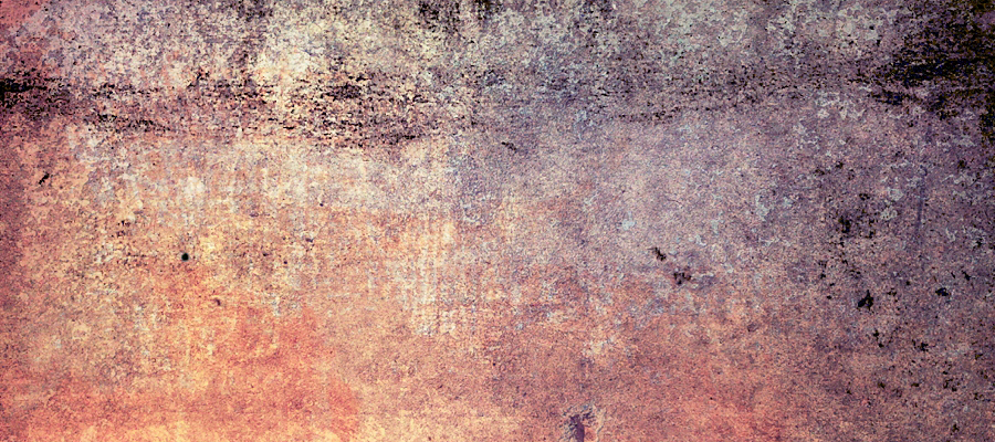
First, we'll use some textures to build up the background. Open "colorfulgrunge5.jpg" from this texture pack, then choose Image > Image Rotation > 90 degrees CCW. Place as a new layer, then hit Cmd/Ctrl + T to access Transform and enlarge to fill the canvas. Name this layer "Texture 1".

Step 3
Add "stainedpaper9.jpg" from this texture pack as another layer. Enlarge, change the Blend Mode to Multiply and label it "Texture 2".

Step 4
Place "colorfulgrunge7.jpg" from the first texture pack as a new layer. Enlarge, change the Blend Mode to multiply again and label it "Texture 3".

Step 5
Add "colorfulgrunge6.jpg", again with a Blend Mode of Multiply and name it "Texture 4". Now import "stainedpaper1.jpg" from the second texture pack and press Cmd/Ctrl + I to Invert to negative, then change the Blend Mode to Color and reduce the Opacity to 15%. Name this layer "Texture 5".

Step 6
Choose Color Balance from the Create new adjustment layer menu at the foot of the Layers tab (1). In the next window click the double circle icon to unlink it (to affect all layers) and copy these settings.

Step 7
Add "colorfulgrunge3.jpg" from the first texture pack, at the top of the layer stack, enlarge to cover your canvas. Change the Blend Mode to Overlay and label it "Texture 6". Grab the Gradient Tool (G) and choose to Foreground (white) to Transparent preset and highlight the Radial setting in the Option bar. Now add a layer mask and drag a series of gradients from the centre out (my mask is shown on the right).

Step 8
Place an unclipped Levels Adjustment Layer at the top of the stack and set the white point Output slider to 169 to darken all layers.

Step 9
Highlight the top Adjustment layer thumbnail, then hold down Shift and highlight your first texture thumbnail (this also highlights the layers in between). Now choose New Group from Layers from the top-right fly-out menu on the Layers tab. In the following window enter "TEXTURES" in the Name field and hit OK.

Step 10
The next stage involves isolating the model from the background. Photoshop has many tools that allow us to achieve this, but in this instance we'll use a channel, or density mask.
First, choose Image > Image Rotation > Flip Canvas Horizontal. Now go to Image > Calculations, in the next window copy these settings to create a composite channel containing the most contrast between the subject and background and click OK.

Step 11
Switch to the Channels tab and you'll see the new channel ("Alpha 1") sitting at the bottom. Target it, then press Cmd/Ctrl + L and apply the following Levels adjustment to increase the contrast.

Step 12
The idea is to create a clean white silhouette of the model, so set the Dodge Tool (O) to: Exposure: 50% / Range: Highlights and use a medium soft-edged brush to bleach the edge pixels as indicated in red.

Step 13
Grab the Brush (B) and use an assortment of different sized hard-edged brushes to infill any remaining grey areas with white. By default, white acts as selective areas, so Cmd/Ctrl-click "Alpha 1" to create a selection, then target the top RGB composite channel.

Step 14
Jump to the Layers tab. Choose any selection tool and click the Refine Edge button in the Options bar. In the next window choose On Black (B) from the View Mode drop-down menu, copy these settings and click OK.

Step 15
You'll now see a new masked layer appear and the visibility of the original layer disabled. Switch on the visibility of the original layer and fill with black. Zoom in and check you're happy with the results of the Refine Edge command. At this point you can modify the mask by painting with either white (to reveal), or black (to hide) with a small soft-edged brush if needed.
When you're happy, drag the mask thumbnail into the trash icon at the foot of the Layers tab and click Apply in the following window.

Step 16
Finally, Cmd/Ctrl-click your top layer to load it as a selection, then use a small black, soft-edged brush to paint over the highlights in the model's eyelash.

Step 17
Place the isolated model as a new layer within your project file. Add a layer beneath it and fill with white. Target the model layer and hit Cmd/Ctrl + E to Merge Down.

Step 18
Select All (Cmd/Ctrl + A) and Copy to the Clipboard. Create a new document in Greyscale Mode and name it "Displacement.psd"

Step 19
Revisit your project file and click back in the History panel to when you added the model as a new layer. Now switch back to your new file and flatten it.

Step 20
Go to Filter > Blur > Gaussian Blur and enter 30 px.

Step 21
Now choose Image > Mode > Bitmap, ensure the Output is set to 300 pixels/inch, select Halftone Screen from the Use drop-down menu and press OK. In the following window set the Frequency to 15 lines/inch, the Angle at 45 degrees and Round under Shape, then press OK again. Now select Image > Mode > Greyscale, keep the Size Ratio 1, click OK and save (with the .psd suffix) to a handy location.

Step 22
Back in your project file name the model layer "Model". Duplicate it and rename "Model halftone".

Step 23
Ensure the "Model halftone" is the target layer, then go to Filter > Distort > Displace. In the next window set both Scale fields to 10, then select the Stretch To Fit and Repeat Edge Pixels options and press OK. You'll now be prompted to locate and load your "Displacement.psd" file.

Step 24
Over the following steps we'll use different sized source files with the Displace Filter and radically alter the settings to create some abstract 3d effects.
Open character X from this alphabet and Save As a .psd file. Duplicate the original "Model" layer again and rename it "Model shatter 1" Now press Alt + Cmd/Ctrl + F to reopen the Displace dialogue window, copy these settings and navigate / select your character .psd file.

Step 25
Repeat the previous step using character S and apply these settings with the Displace Filter on another duplicate layer labelled "Model shatter 2".

Step 26
Use the same technique using character Z as the displacement map with the following settings on a final "Model" duplicate and name it "Model shatter 3".

Step 27
Change the Blend Mode of the "Model" layer to Overlay, then move it up the layer stack above "Model shatter 1".
Add a mask to the "Model halftone" layer. Now load the "grunge_brushes.abr" brushes and use them in a stamping fashion so only selective edges remain around the model. When painting open the Brush panel (from the Options bar) and flip/rotate the Brush Tip Shape to avoid repetitive strokes.>
If you remove more than you need, reinstate areas using a white grunge or basic brush. My mask is also shown at the bottom of the screengrab for clarity.

Step 28
Now mask the "Model" layer with a selection of grunge brushes as well.

Step 29
Continue to mask the remaining displacement layers. Here's the mask for the "Model shatter 1" layer.

Step 30
The masked "Model shatter 2" layer.

Step 31
And finally, the masked "Model shatter 3" layer.

Step 32
Now duplicate the original "Model" layer again. Reset its Blend mode to Normal and modify the mask reveal the model's face.

Step 33
Duplicate the "Model halftone" layer, change the Blend Mode to Soft Light. Now enlarge the layer content so the dots extend slightly and modify its mask as shown.

Step 34
To boost the contrast of the model, add a Levels Adjustment Layer to the "Model copy" and apply these settings. To limit (clip) the adjustment to the target layer, click the double circle icon.

Step 35
To keep your file organized place all the model and shatter layers within a folder called "MODEL". Add "Paint_1.png" as a new layer above your "TEXTURES" folder, change the Blend Mode to Multiply and name it "Splat 1". Repeat using "Paint_2.png" and "Paint_3.png". Label these layers accordingly and position around the model.

Step 36
Add character O from the 3d lettering download above your previous layer. Set the Blend Mode to Multiply and label it "3D 1". Transform / position centrally behind the model's head, then mask as shown.

Step 37
Duplicate this layer, rename it "3D 2" and position bottom-right. Now change the Blend Mode to Soft Light and adjust its mask accordingly.

Step 38
To keep your project file tidy, add all the floating layers within a folder called "ELEMENTS 1". Now add a mask to the "TEXTURES" folder and use an assortment of grunge brushes to reveal areas from the black "Background"layer.

Step 39
Place "media-militia-wireframes-03.png" from this wireframe pack as new layer in Multiply Mode at 50% Opacity above the "MODEL" folder. Transform / position at the base of your canvas to cover the model's arm and name it "Wireframe 1".
Cmd/Ctrl-click the "Model halftone" thumbnail to create a layer-based selection. Ensure your "Wireframe 1" is the target layer, then go to Layer > Layer Mask > Hide Selection. Deselect and apply a white to Transparent angled Linear Gradient bottom left, then a Black to Transparent Radial Gradient over the model's shoulder to reveal the line work.

Step 40
Place "media-militia-wireframes-12.png" from the same pack, Transform / position bottom right and name it "Wireframe 2". Press Cmd/Ctrl + I to Invert the layer to negative and set the Blend Mode to Soft Light, but leave the Opacity at 100%. Now mask with a selection from your "Model halftone" layer.

Step 41
Add "Paint_4.jpg" at the top of the layer stack and Rotate, resize, position over the model's left eye and name it "Eye splash". Change its Blend Mode to Multiply and lower the Opacity around 60 - 70% to blend with the model's skin. Now use a small, soft to medium hard brush to mask it.

Step 42
This following couple of steps will work a lot better using a tablet. Add a new top layer called "Linework 1". Grab a hard-edged 7 px white brush and doodle over the model's face and shoulder. Try and follow the natural contours, but don't worry about being too precise as a lot will be hidden in the next step.

Step 43
Change the Blend mode to Soft Light to reduce the effect, then use a large soft-edged brush at a low opacity to mask as shown.

Step 44
Add another layer and use a slightly larger hard tip to trace over the model's key features. Name this layer "Linework 2" and mask is as required. Now place these two layers along with the underlying ones into a folder called "ELEMENTS 2".

Step 45
Before adding the text and logo, sit back and review your composition, then carry out any final adjustments. I used a combination of the Patch Tool (J) and the Clone Stamp Tool (S) on some displacement layers to remove awkward looking shapes overlapping the model's shoulder. Next, I reduced the Opacity of certain texture layers as indicated and finally tweaked a couple of masks.

Step 46
Grab the Text Tool (T) and add the letters CRE using this font. Open the Character and Paragraph panels (from the Options bar) and set the point size to around 89 and align it right. Duplicate the text layer, then Shift-drag down and type the letters ATE.
You'll now need to manually reduce the space between the A and E. To do this, place your text cursor between the two characters and set the kerning value to -100. Now place both text layers within a folder labelled "GRAPHICS".

Step 47
Open the "Logo.pdf" from the "source" folder directly from Photoshop, or via Illustrator, then Copy > Paste as a Smart Object and place bottom right within the same folder.
Add a folder mask and break up the text with an assortment of grunge brushes. Now reinstate the mask with white as indicated to keep the logo intact.

Step 48
To tone down the overall color, add an unclipped Hue/Saturation Adjustment Layer at the top of the stack and set the Saturation slider to -36.

Step 49
Create a layer-based selection from the logo and fill with black on the adjustment mask. Finally, paint with a soft brush within a selection created from the "Model" layer to bring back the color intensity of the eyes and lips.

Conclusion
As you've discovered, the Displace Filter can be fun to work with and also produce some fantastic results. It's worth remembering that the Displace filter works by aligning the top left edges on both the target layer and the displacement file, so for predictable results always Merge the target layer, or Crop your image so both files share the exact pixel dimensions.
Happy accidents can happen by using displacement maps of different dimensions to your target file and also experimenting with the settings in the filter window.

