This step-by-step tutorial covers my basic digital painting techniques. Included in the tutorial are my basic brush settings, some of the fundamentals of painting, and other useful tips. This wonderful tutorial was done by the talented artist Zhrayde. You will need a basic understanding of Photoshop for this tutorial. You have to prepare a sketch as start and identify light source, then adding your paint, light and shadow effects. You can use the same way to process your own sketches with reference to this tutorial’s techniques. The detailed explanations at each step should make it easy for beginners to catch on.
Brushes
I primarily use two brushes throughout an entire painting. The first is a 10 px Hard Round which is my Pencil Brush. To create the Pencil Brush set Size Jitter, Opacity Jitter, and Flow Jitter to Pen Pressure. Below is an example of this brush.

My second brush is a bit more complicated--the Blending Brush (Shown above). It's still a Hard Round brush but I saved the brush preset without a brush size.** I do this for two reasons: 1) I prefer setting the size with keyboard shortcuts; 2) this way the brush size won't reset itself when I select the brush. Also, I have Shape Dynamics unchecked for this brush; this way the brush size is always the same width. Flow Jitter is set to Pen Pressure and Opacity Jitter is Oft
There is one more setting to get the Blending Brush to blend the way I like. In the Options Menu at the top menu bar you will see Opacity and Flow options. I set Flow to 10% or less when I'm blending. An example of the Blending Brush at 5% Flow is below.

**To save a brush without a size, select "New Brush Preset" in the "Brush Preset" palette and when the "Brush Name" menu pops up uncheck the "Capture Brush Size in Preset".
Lighting Basics
Below are a set of spheres that demonstrate a basic rendering process. I'm using a sphere as an example because it is the easiest shape to render.

1) Without any light or shadow this is what an object would look like—flat. This first step is the block-in. No light or shadow is defined, just the local color. The block-in should be a midtone value.
2) The form shadow is the portion of an object facing away from the light Form shadows have a soft edge because it defines the
gradual transition from light to shadow.
3) The light is where the light source is reaching the surface of the object Don't let the light and form shadow touch. The midtone value should show between them.

4) The midtone is the value between the light and form shadow. It's the indicator of an object's actual color and has the highest saturation.
5) Reflected light is when light bounces off a surface and hits an object from behind. The reflected light should be darker than the midtone.
6) The highlight is the area of an object receiving the most light This is usually a relatively small area since only planes perpendicular to the light source receive the most light. Don't overdo highlights.

7) A cast shadow occurs when light is being blocked because of an object in the way. Because cast shadows are a result of blocked light, they have hard edges.
Now onto the actual painting!
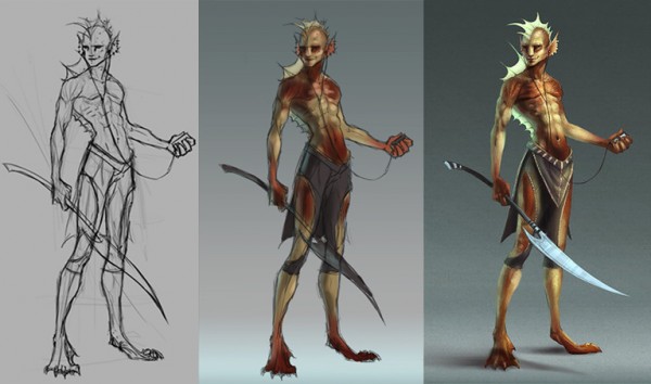
Step 1: Begin with a sketch
Before I start talking about the sketching process I should mention that I like to draw/ paint on a gray surface instead of a white one. The reason is so that I can see my values better as I paint. A light canvas will make dark values look darker and a dark canvas will make light colons look lighter.

I usually begin with a loose sketch before I start painting. It is much easier to paint when you have a solid drawing to start with. In the sketch process I'm working out the pose and gesture.
Step 2: Blocking in color
This step is pretty straight forward: block in the local color for everything in the painting. This is exactly the same as the block-in example in the Lighting Basics demo above. Not worrying about light and shadow at this point, just local color.

At this stage, I'm mostly thinking about what colors I want in my color palette. I'm also thinking about value and made the pants darker than his skin.
I'm putting all my colors on a layer beneath my sketch layer. This way it is easier for me to make adjustments to the sketch layer later.
I'm keeping all my strokes very loose since this is still in the very early stages.
Step 3: Adding form shadows
Adding form shadows basically involves separating the light side from the shadow side. This step is rather important If you don't clearly define the light from shadow, everything following won't look quite right.

Tip: The midtone should have the highest point of saturation than the light and fonn shadow do. So when you paint in your form shadows make sure they are less saturated than your midtone color.
I've added a gradient to the background so the character is pushed forward more. This creates depth. Depth is something you always want to achieve in your paintings.
Step 4: Adding the light
Finally, we can paint the light! Light is actually very easy to overdo. All you need is a little bit to make things pop but it can be so tempting to put more. Use your lights sparingly. Also, make sure not to cover up your midtone. As I mentioned in the Lighting Basics demo, don't let the light and form shadow touch.

I do have some of the reflected light painted in for this step. Often times I will work the light and reflected light at the same time to show where my core shadows are.
For Steps 2 - 4 I've been painting under the sketch layer. Things are still very loose at this point. The next step is to begin refining the painting.
Step 5: Refining
At this point, I have a sketch layer with a color layer beneath it. Before I begin refining my painting I reduce the opacity of the sketch layer and merge it with the color layer. On a new layer above the merged sketch layer I do all the refinements.

To refine the forms of the character I'm building up the form shadows, midtones, and light as I did in the previous steps. I'm also adding in the reflected light to make the character appear more dimensional. Along with the reflected light is a secondary light source coming from the glowing green fins. Since green and red are complimentary colors on the color wheel, the green will make the red come forward and create depth.

Up to this point I haven't added any details. My primary focus is to render the forms, details are added last.
Step 6: Cast shadows, highlights and details
All the tedious hard work has been finished in Step 5. Now we can start adding all the cast shadows, highlights, and details. This may look like a huge jump from Step 5 but this step is really just polish.
All that's happening is I'm bumping up the lights and reinforcing the shadows.

I darkened the gradient in the background so that the glowy fins would look brighter. Having the darker background also enhances the focal point—his head.
Tip: The focal point should be the hightest contrast between light and dark It should also be the sharpest area in the painting.
like to overlay my detail over my painting so it's easier to make changes later if necessary. To do this I create a new layer above my painting. I set the new layer to Overlay. Then I use one of my custom brushes to lay in a texture. Below are some examples.

Animated Process
You can see how I painted this:

Common problems for beginners
For this next part I'm going to try to list a few of the common problems beginners have when painting. I'll provide a quick example of each and also an explanation how to improve it.
Problem: Too much contrast.
Often times when beginning artists do a grayscale painting they use black for the shadows, white for the light, and gray for the midtones. This results in a blown out image.
Solution: It's best not to use pure white or pure black in your painting. Instead use dark and light values of gray. It doesn't require a broad range of value to create the appearance of light versus shadow. Notice how light the shadow value in Image B looks compared to black.

Even when painting black or white objects you shouldn't use black or white. You can use local value to get the illusion of black and white, and you're Feinting won't be too high in contrast. To the left is an example of a black ball and white ball. Neither use black or white in their value scale.
Problem: Timidity
When an artist is timid they won't push the value in a painting for fear of mining it. This results in a flat painting with little contrast. Shadows may be unclear or nonexistent. Lines may even be used to describe form where light and shadow should be the defining factor.
Solution: The only way to break out of this is to take risks. Working digitally actually makes this easy since you can create new layers to work on without damaging the layers underneath.

Problem: Flat Color
A painting looks flat when the artist uses only light and dark values of the same color to render form. Often the color looks grayed out and bland.
Solution: You will make the painting more lively by using a wider range of colors and properly managing the saturation. This is especially true for skin color. Notice how much more lively Image B looks compared to Image A.

Comparing the color meter for Image A with Image B, you'll notice Image B has more depth. This is for a variety of reasons:
1) More than one color is used. A purplish color is used for the shadows, a redish color is used for the midtones, and a yellowish color is used for the lights. I've also added some greens and blues into the mix.
2)A cooler color was used in the shadows. This gets into a bit of color theory, but basically the cooler colors in the shadows make the warmer colors in the lights come forward.
3) A higher saturated color was used in the midtones. High saturated colors advance while low saturated colors recede.
Final Result:

That's the end of this painting tutorial. I hope it's been helpful for you.
If you have any questions feel free to ask.