When customers have a ready association with your company and come to trust it, your marketing effort becomes much easier. Take Amazon for example. People know they can count on finding anything they want and having it delivered quickly. When people see Amazon’s golden arrow—even without the word “Amazon” above it—they shop confidently.
However, it took time for that association to take hold. A huge part of this effort was creating a timeless logo design. Working with a logo maker to produce something capable of communicating your values while standing the test of time is a worthy goal.
These tips will help you accomplish that task.
Know Yourself
What are your core values? What is the purpose of your business? To whom are you trying to appeal? (BTW, if you answered “everyone,” you’re going to fail.) What are your key attributes? What is your unique selling position? What can you offer that few (ideally none) of your competitors can offer? When you get a solid handle on this, you’ll have a framework within which you can define your target market.

Photo Credit: Eddie Lobanovskiy
Know Your Customer
Where are they socioeconomically? What are their values? In what do they find beauty? How do they prefer to communicate? What are their expectations from your products or services? Gaining a clear understanding of who these people are better positions you to craft a design capable of holding appeal for them over an extended period of time.
Consider Existing Examples
No, we’re not saying copy the Coca Cola logo, we’re saying examine it and other iconic designs to figure out why their appeal has endured. The Apple logo, the Nike swoosh and the McDonald’s golden arches all have one thing in common. OK, actually two: They’re simple, and massive marketing efforts have cemented them into the minds of consumers. Still, even if you don’t have a Nike budget, you can capitalize on simplicity and push hard within your core constituency to achieve notoriety.

Photo Credit: Eddie Lobanovskiy
Simplicity Endures
The temptation to create something with fanciful elements leveraging contemporary trends to capture attention is strong. Resist it. What looks cool today will look dated tomorrow. Consider the Prince film “Purple Rain” from 1984. During its time, the fashions worn in the picture looked thoroughly modern and edgy. Today, they just look silly. Flourishes age while simplicity endures. One notable exception to this is the Coca Cola logo, which is itself one big flourish. However, the look says classic rather than trendy, which imbues the brand with an aura of dependability.
Think Versatility and Scale
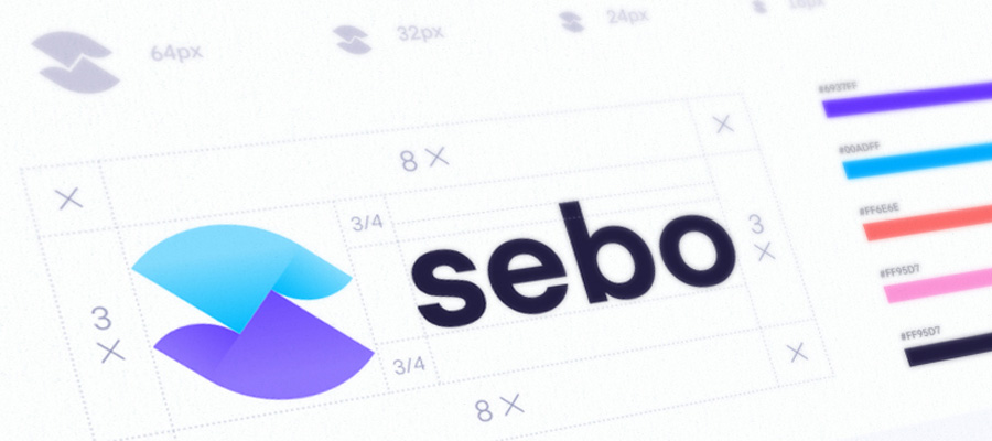
Given it will appear on business cards, t-shirts, mugs, hats, billboards, email messages, social media posts and a host of places we haven’t even thought of yet, it’s important to make sure the design looks good in as many different environments as possible. The logo should also be easy to duplicate on a variety of materials such as metal, cloth, paper, glass and even wood.
Along those same lines, the emblem will be rendered in a wide variety of sizes to fit those various applications. Does it still read when it’s very small? If you incorporate text, it will need to be instantly decipherable in every circumstance. Tiny details will disappear in smaller applications; don’t bother with them when you’re working with your logo maker.

Photo credit: Mike
Color Shouldn’t Matter
Let’s go back to the iconic designs we mentioned above for a moment. Yes, the McDonald’s arches are golden, as is the Amazon arrow. But they still read when they’re rendered in black and white. While timeless logos use color, they don’t rely upon it. The underlying design does the heavy lifting—not the color.
Timelessness Is Relative
While creating a timeless logo design is a worthy goal, it’s important to keep evolution in mind. Even though it’s touted as one of the oldest commercial logos still in use, the Coca Cola logo has evolved over time. So have the golden arches and the Starbucks siren. The key is the basic elements of the design have endured, while subtle changes were made to keep the look fresh.
Keeping all of these factors in mind, you’ll come up with a “timeless” logo too.


