If you wanna create something interesting, you can have a try to create a composed scenery. Any objects can be composed and turned to be an artwork. This tutorial will walk you through the steps of how to create your very own futuristic artistic portrait. There are quite a few tips and tricks you’ll learn along the way, it’s definitely worth reading. The tutorial is thoroughly explained, it reveals not only the technical aspect, but also how the ideas comes to life and how they morph to fit seamlessly in the same design.
This is a advanced level tutorial so some steps can be a little tricky, but if you have your basics down and you have copy of Photoshop CS5 Extended you should do fine.
Resources Used In This Tutorial
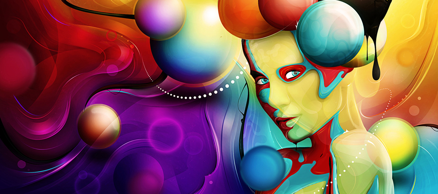
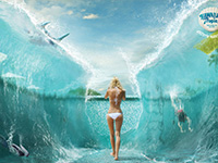
Final Image
Here is a preview of the image that we are going to be creating:

Step 1
Start by creating a new document (800X800px). Paste in your nebula photo and position it to fit nicely within your canvas.

Step 2
The nebula image is looking a little blurry, so go to filter>sharpen>unsharp mask. Apply the mask using the settings below:
Unsharp Mask Settings:
Amount: 70%
Radius: 1.5 pixels
Threshold: 0 levels

Step 3
Now we want to add some light effects to our background.
Create a new layer called ‘center highlight’. Drag out a white to transparent radial gradient from the center of your canvas.

Now change this layer’s blend mode to ‘overlay’:

Now create a new layer called ‘white highlights’. Repeat the last step, creating a series of smaller white to transparent radial gradients:

Now create a new layer called ‘rainbow highlights’. Drag out a series of smaller white to transparent radial gradients. Then go to blending options for this layer and apply a gradient overlay, selecting the rainbow default gradient.

Ensure that your layer is set to ‘overlay’ blend mode:

Finally, reduce this layer’s opacity to 5%, giving a subtle light effect:

Step 4
Now create a new layer called ‘vignette’. Use a large soft black paintbrush, set to 60% opacity. Now brush around the corners and edges of your canvas:

Step 5
Roughly cut out your model face photo and paste it into your document:

Now apply a levels and color balance adjustment layer (apply a clipping mask for each, so that they only effect your underlying face layer, not your entire image):
Levels Adjustment Layer Settings:
17 / 1.00 / 233
Color Balance Adjustment Layer Settings:
Highlights: -9 / -11 / -19
Midtones: -29 / +1 / +6
Shadows: -18 / -4 / -8

Now using your pen tool cut around the edges of your models face, to get a smoother more curver selection. Once you’ve got your path in place, right click on the path in your paths palette and click ‘convert to selection’. Then return to your layer’s palette and hit the ‘create layer mask’ icon. This will automatically mask off the areas of your model’s face that are outside of your path selection.

Now with your layer mask in place, download the brush sets from the resources section for this tutorial. Using the brushes (ensuring that you use a black paintbrush) paint over various parts of your model’s face. This will create a cool vector style effect, whereby shards of your model’s face become masked off. With this step it’s important just to experiment with what you feel looks good. Remember, if you do something wrong you’re working non-destructively using a mask, so you can simply undo your mistake!

Step 6
Now download your paint tossing images from the resources section for this tutorial.
Download the red image from the set and open it up in a new document:

Now we want to isolate our paint splatter from the black background. To do this, duplicate your paint splatter layer. Hide the duplicate layer and select the original. Go to image>adjustments>levels and use levels to really up the contrast of your image. The idea is to get the splatter looking as separate from it’s background as possible, so make the darks/midtones darker and make the highlights lighter:

Now go to select>color range. Use the color range eye dropper to click on the black background of your image. You can see in the image below that this creates a good selection of your background:

Hit ok and your background will be selected. Then go to select>inverse to invert your selection and select your paint splatter. Go to select>modify>contract and contract your selection by 2px (this gets rid of any messy edges).

Finally, unhide your duplicate paint splatter layer and select it in your layers palette (we want to use this layer after all, not our high contrast original splatter layer – this was just for getting a good selection). With your color range selection still in place, copy and paste your paint splatter into your original document:

Step 7
Now go to edit>transform>warp and warp your splatter into a more fitting shape for your composition, making sure that the bottom of the splatter overlaps your woman’s face:

Now apply a layer mask to this layer, and use a medium sized, soft black paintbrush at around 20% opacity to smoothly blend your splatter into the woman’s face:

Now apply a hue/saturation, levels and color balance adjustment layer to this layer, ensuring that you create a clipping mask for each.
Hue/Saturation Adjustment Layer Settings:
Hue: 0
Saturation: -100
Lightness: +25
Levels Adjustment Layer Settings:
20 / 0.96 / 218
Color Balance Adjustment Layer Settings:
Highlight: +13 / -12 / -60
Midtones: +21 / -9 / -11
Shadows: -13 / +1 / +8


Step 8
Now repeat step 7, applying several more paint splatters:

Step 9
Now repeat steps 7 and 8, but leave a large splatter filling the right side of your canvas:

Now go to filter>blur>gaussian blur. Apply a 2.8px strength gaussian blur to your large paint splatter layer. This should help create the illusion of depth:

Step 10
Repeat step 9, adding a larger paint splatter to the bottom left of your canvas. This time apply a gaussian blur of 7px strength, to add a further layer of depth to your composition:

Step 11
Now create a new layer called ‘shadow detail’. Grab a 2px soft black paintbrush and carefully paint in shadows on all the cut out areas of your model’s face. You want to give the impression of depth here, so try to establish a light source when you’re painting.
It helps to zoom in whilst you’re doing this step as otherwise it can get very fiddly!
The images below show your shadows up close and then at 100%:

I reduced the opacity of this shadows layer to 70% just to make the effect somewhat more subtle:

Step 12
Now create a new layer called ‘lens flare’. Fill your canvas with black and then change this layer’s blend mode to ‘screen’ to hide the black. This will allow you to work with a lens flare effect in a non-destructive way.
Go to filter>render>lens and apply a lens flare in the top right of your canvas. Then change this layer’s blend mode to 80%. The images below show the lens flare layer at normal blend mode and then screen blend mode:


Now apply another lens flare in the left area of your canvas (on a new layer of course):

Step 13
Now create a new layer called ‘colored highlights’. Drag out a series of bright radial gradients, ranging from a neon color to transparent. Try to pick neon colors that compliment your overall composition:

Now change this layer’s blend mode to ‘overlay’ and reduce it’s opacity to 10%:

Step 14
Now create a new layer called ‘dodge/burn’. Fill your canvas with 50% gray and then change this layer’s blend mode to ‘overlay’. This will let you non-destructively dodge/burn your image.
Use a soft black paintbrush for your shadows and a soft white paintbrush for your highlights. Use this stage not only to build up your shadows and highlights but to better blend together your various visual elements.
The images below show your dodge/burn layer at ‘normal’ blend mode and then ‘overlay’ blend mode:


Step 15
Finally, add a final gradient overlay adjustment layer (do not apply a clipping mask to this layer). Select a gradient overlay ranging from 9400e1 to 00601b. Reduce this layer’s opacity to 7%, for a subtle final tint:

And We’re Done!
You can view the final outcome below. I hope that you enjoyed this tutorial and would love to hear your feedback on the techniques and outcome.