![]() In this tutorial we will create a really macabre composition in Photoshop, I will focus on the collage and building part of my process. This tutorial will give you some ideas for your own work as well as showing you how to combine photo collage and digital painting in a less sterile way than the typical matte paintings. We will start with a black and white image, and work until I like the balance and values, then add the color. This is a useful tutorial for users of all levels. If you have any questions or if I missed something, post a comment and let me know it.
In this tutorial we will create a really macabre composition in Photoshop, I will focus on the collage and building part of my process. This tutorial will give you some ideas for your own work as well as showing you how to combine photo collage and digital painting in a less sterile way than the typical matte paintings. We will start with a black and white image, and work until I like the balance and values, then add the color. This is a useful tutorial for users of all levels. If you have any questions or if I missed something, post a comment and let me know it.

Resources: The main stock image used on this tutorial is available here.
Tutorial Details
- Program: Adobe Photoshop CS5 (CS3+ compatible)
- Difficulty: Medium
- Estimated Completion Time: 15 Hours
Step 1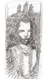
First things first, I did a quick and rough sketch just to give myself a VERY basic idea of where I want the piece to start. You’ll notice that the finishes is quite different from my sketch, which I think is fine in personal work! In fact, it’s part of what keeps things exciting, in my opinion. So I’ve started to do some light painting, using a slightly textured custom brush with about 30 opacity and 40 flow, just covering up most of the pencil to start with. I’ve done a tiny bit of rendering in the face, nothing too intense. I’ve also added some ink and splatter to keep things looking more alive. Sometimes doing inks in the computer can look way too clean or soft. Getting a sense of grit early on is important, and even if you cover it up as you build over top it will enrich the final product, I promise. So far things are looking kind of boring. It’s too still, too peaceful, not very dynamic or interesting.
Step 2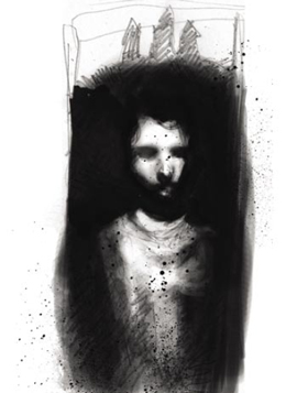
That’s better! I’ve decided not to stick so closely to the sketch, and let the city spill out over the border. I want some chaos and movement around my figure so I’ve decided to build the city up around and on top of him. The person can stay serene and still as long as the city has life and motion to it. (insert building1.jpg and building3.jpg) I grab a few photos I took around town that I think could work, play with the levels until I find what feels like the right balance, and then pile them on! Painting out sections with the layer mask helps things to blend together a bit more easily, but at this point it’s really all about shapes.
Step 3
Now I’m actually getting excited about the piece. I like the shapes and adding the powerlines (a favorite crutch of mine) keeps the eye moving and feels appropriate to the piece. (insert wires.jpg, buildings2.jpg and buildings4.jpg) for the wires I upped the contrast all the way on some photos of phone lines and then copy sections I want, and paste them as a multiply layer. Then it’s just a matter of banding them to look natural using transform-warp. I use some new building facades as well to filll some of the space around our central figure, and set the layer property to screen. I also add some grey tone at this stage, and paint parts out with the layer mask to get a nice value structure and make sure the right places get focus. I want to make sure my figure doesn’t get TOO buried since he is our focal point.

Step 4
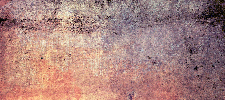
This step is mostly just little adjustments, piling on more little pieces and texture to fill out the piece. I want there to be tons of wires, telephone poles, lamp posts, etc. I’ve added a section of fence, some street lights, all the things that catch my eye when I’m in the city, and also that crazy splattery eclipsed sun. (insert buildings5.jpg and texture.jpg) I’ve also overlayed this pretty awesome running paint texture over sections that felt too flat and dull. It’s really handy to keep a folder of pictures like this one (preferably that you take yourself). I think it goes a long way towards keeping things from looking too clean and sterile, and a sort of human touch is something that’s really important to me in my work. To this end I’ve also added some more ink and splatter, as well as a little oil paint texture, since I did bury most of the ink from the early stages. At this point I’m pretty happy with how things are looking in black and white, and we can flatten and add some color.

Step 5
I’ll let you all in on a trick that I use fairly often. Image-adjustment-variations. It’s not terribly refined, but it can be a great way to add some color to a flat b/w image. I usually make a copy of the flat image, then try out some variations, lower the opacity and layer them until I’ve got some rich an interesting color as a base to work on top of. Then it’s just the usual color overlays, a bit of texture work, and some multiply layers. I paint into the face some more at this point to give it a bit of a glow and a richer skintone. I mostly do this with a few overlay and soft light layers with varying opacity, and a low opacity brush, then some highlights to finish him off. I’ve added some dot tone to the architectural sections at this stage also to give them some more texture and also help differentiate between building and man. I wasn’t the man to seem nestled in, surrounded, even a part of the building, but still markedly distinct from them, at least texturally. Basically this stage is a lot of little refining touches and push and pull. I added the blue windows and shapes at the bottom at the very end of the process and I don’t think I was satisfied with the piece until I did. I’m always a big fan of tan and blue as a color scheme, and I think they do a lot to draw the eye through the piece.

It’s always worth exploring weird color experiments, especially in digital work like this, since you never have to really commit to anything. Well there you have it! Hopefully this was at all helpful, and if you didn’t learn anything, maybe my crazy process gave you some ideas to try out in your own stuff. Good luck and keep it brutal.
Final Result

