How your website is designed is one of the huge reasons for your success. You and your developers should have taken the utmost tanda care while developing it. Nice designed websites should include usability and utility, this will determine your success and not just the visuals of the website. It will be the face of your business and it is the one your potential customer will see before they even browse on your site. With this, you should design your website meticulously and cautiously. Missing in any aspect could end up destroying your site and worst case - your brand.
Designing your website is more critical than you think. It is not just all about conversion, even when you are using a great conversion boosting tactic, it will not work if it lacks quality. As a matter of fact, website designing doesn’t necessarily mean how it looks like and feels like but it is about how it works. Even a plain looking website with amazing usability and good configuration performs amazingly on Google. Users' opinions of such websites are also higher compared to those with poor user experience. The performance entirely depends upon the effectiveness of the website.

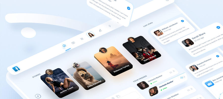
Dmm_ by Tran Mau Tri Tam
Although there are varieties of website designing, the principles are always the same. Here is the list of 7 important principles which will make your website design good looking, user-friendly, effective, and very engaging:
1. Keep It Simple
If you over-design your website it may not work, you should avoid putting many elements on the page because it may lead to distracting visitors from the main point of your website. Keeping it simple is always effective. The straightforward and responsive web design of your website not only makes the website appealing but also helps the user to navigate from one page to another effortlessly. Making a website that has design features that do not serve the purpose of your brand may be frustrating. Keep your website as uncomplicated as possible so that the visitors can feel that it is efficient and can find their ways easily.
2. Keep it Consistent
Being consistent in designing your site matters a lot. Put attention to match your design elements in all of the pages. Your fonts, sizes, headings, sub-headings, and button styles must be uniform all throughout your website. Research and plan every detail in advance. Plan the font, combination of colors, buttons, and follow them in the development process. You can use Cascading Style Sheets to keep complete information about design styles and elements.
3. Make it Compatible With Mobile
Nowadays people just use mobile phones, tablets, and iPads, so you should design your website to be compatible and work for all types of screens. People mostly browse on their phone while outside, and everything is doable through a mobile phone. Your website design should work in all screen sizes because if it doesn’t, you’ll easily lose your visitors and customers to your competitors.
4. Make it Readable
Even though your design is good, the text is still one of the very important factors. The text provides visitors the information they want to see. You should keep your typography visually enticing and readable for visitors, along with the tricky use of keywords, meta-data, and other SEO-sensitive stuff. Choose to use fonts that are easier to read and not complicated. There are lots of fonts to choose from, just make sure you do a proper combination of typefaces for each and every design element such as headlines, body texts, buttons, etc.
5. Add Colors and Image
A perfect color combination entices visitors while a poor combination of colors can lead to distraction. This requires you to pick a perfect color palette and combinations for your website which can produce an attractive atmosphere, thus making a good impact on your website visitors. You can enhance users’ experience by selecting a good color palette to give a balanced and refreshing look to your website design. Remember to use white spaces because they help in avoiding your website from becoming a visual clutter and a mess. You should avoid using too many colors too. You should limit it to three or four tones for the whole website, they are enough to give an appealing and clear design. The same with putting images. Don’t use multiple vibrant images, as it may result in a messy interface.

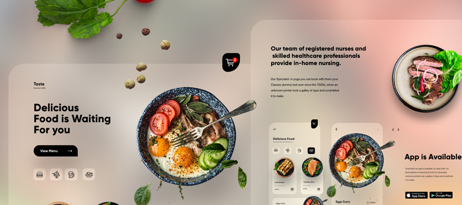
Nutracheck Website Redesign by Cuberto
6. It should be easy to load and navigate
Your website shouldn’t take too long to load, it will annoy or bore the visitor if they wait too long. Resolved it by optimizing image sizes, combining code into a central CSS or JavaScript file as it reduces HTTP requests. Moreover, you can compress HTML, JavaScript, and CSS for enhanced loading speed. Visitors also tend to spend more time on websites if it’s easy to navigate. For better navigation, you may create a logical page hierarchy and lots of clickable buttons.
7. It should easily communicate to your visitor
The main purpose of people who visit your website is to get information from you, and if your website is able to communicate with your visitors effectively, they will most probably spend more time on your website. You should create an easy to navigate website. Use techniques that may work to build effortless communication with the visitors and organize your information on the website by making good use of headlines and subheadlines, removing the waffle out of the web, and using bullet points, rather than long gusty sentences.
Now that you have enough knowledge to design your own website, add some patience, hard work and determination. It will always be a hit and miss for the first time. Trial and error will be hard but it will always help you upgrade your website in the long run. If something is not quite right or compatible, you can always try and design it to be a better version again. And without these seven important principles, it would be a hard and difficult journey for you. But with a good and user-friendly design, you can succeed in web designing. Just follow the above list of information to improve your site’s user experience and business reach.


