This article will help you learn the present trends, tips and challenges and will also provide you with a showcase of mobile websites. Technology changes every now and then and mobile web design technology is no exception to it. Further the given article is an important source for the newbie’s who are interested to design mobiles.
Your mobile site, in most cases, should be simpler than your standard site. The only exception to this is if your standard site is already very minimalist. Eliminating graphic elements from your site is usually an effective way to optimize its display on a mobile device. Taking a web site to the small screen comes with a host of considerations: device width, available bandwidth, touch versus click interfaces, browsers with limited functionality, etc.
At the same time, the simplicity of these mobile browsing environments lowers the barrier to entry for developers. Look for ways to simplify both the design and functionality of your site. This might mean redoing your menus, eliminating images, breaking up text over multiple pages, or otherwise re-working your site’s layout and functionality.
If you’re going for a creative look, feel free to keep it creative. Just like with traditional web design, creative navigation should still be usable, meaning the user should be able to understand how to use it right away, and be able to use it easily!
1. RESPONSIVE DESIGN
When it comes to mobile design, responsive web design often comes to mind. Have a layout that is fully flexible while implementing other practices that help out mobile users or otherwise, such as saving on bandwidth and file sizes for lesser devices, changing image sizes, and having alternatives for certain features (like video) that may not be supported by all devices.
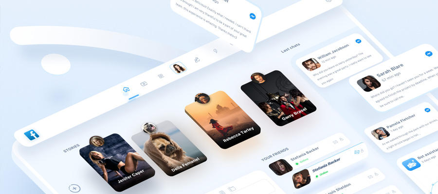
2. HELPFUL ICONS")
One major trend for mobile design that can also be considered a great design practice is the use of icons. This is especially helpful for primary navigation, but icons can also be of great use for other types of links, or even as just visual helpers.
3. WHITE SPACE
White space is an important criterion for good web designing and it is actually a challenge for the designer because out here the visitor is connected the most. The screen size being tiny makes us think about the necessity for a white space while designing a mobile.
4. SIMPLE OPTIONS
The vital aspect of the mobile websites includes the scale down properties made available to the customers. The simple option allows a user to become handier with the mobile networking via internet but the main point here is to cut the immaterial stuff out.
5. LACK OF IMAGES
") The designers are free to use things like bandwidth-hogging video and images with a high speed internet at their disposal. The wish of a visitor is to view images on desktops or on their laptops and thus images are used in ample amount. But you must remember that their must be minimal possible use of images in the mobile version because they do more harm than good. We find in the market a number of mobile net connections of various speeds and they also differ for prices. It becomes difficult for the visitors to visualize images as the screen is small and the matter is hard to read.
The designers are free to use things like bandwidth-hogging video and images with a high speed internet at their disposal. The wish of a visitor is to view images on desktops or on their laptops and thus images are used in ample amount. But you must remember that their must be minimal possible use of images in the mobile version because they do more harm than good. We find in the market a number of mobile net connections of various speeds and they also differ for prices. It becomes difficult for the visitors to visualize images as the screen is small and the matter is hard to read.
6. PRIORITIZED CONTENT
The web designers should design the mobile keeping in mind the visitors or the users. The content plays a pivotal role because the visitors are deeply interested in it. No doubt, the plain pages and the simple options make it easy for the users to go through the matter shown. The mobile websites are free of advertisements. The common masses who regularly visit the mobile website pay great heed to the content material.

7. SCREEN SIZES
With the demand of the iPhones and its competitors in the market, the recent trend is towards big screens. The web designers meet with various screen size problems and their consequent results but particularly the mobile designers face a variety of challenges as it is different from dealing with different kinds of desktop monitors! The designers are at ease to deal with the problems that arouse out of the different screen sizes of the desktop monitors but it needs a specialized skill to handle the screen size problems of mobiles. Mobile technology is frequently developing and so are screen sizes. No doubt the designers now are lucky because primarily the modern mobile devices are having big screens but the older ones are still in existence.
EXAMPLES OF MOBILE WEB DESIGN
Victoria’s Secret – Valentine’s Day
")
Quaintology
")
Victoria’s Secret – Wedding
")
Nordic Ruby
")
Take Me Fishing
Denon Graphic
")
Travel Tex
")
Siblify
")
Digiti
")
Mcipollini
")
Dot Slash
")
Cisco London 2012
")
Autoricambi
")
Arriva Bus
")
Visit Tampa Bay
")
Democracy Now
")
Cruise Saint Lawrence
")
Moire Marketing
")
Collage Creative
")
Creative Edge
")
Stuart Weitzman
")
Vivacitas
")
CAT Rental Store
")
Yyoga
")
Enfamil
")
Hormel
")
Velirium
")
St. Louis Community Credit Union
")
Hire Kenny
")
Alpern Rosenthal
")
ESPN
")
Staples
")
Vanderbilt
")
Checkers
")
Flu Awareness
")
Hoogdesign
")
Volvo
")
Jet Aviation
")
Republic.co.uk
")
Mad Mobile
")
Timberline Lodge
")
Glucone
")
Pieper & Associates
")
Jon Gordon
")
Audi A7 Bold Design
")
Movies.com
")
Chevrolet
")
Mitsubishi Motors Sweden
")
Omaha Steaks
")
Cleartrip
")
House of Fraser
")
Sea Doo
")
Lapse, Zachary J. Miller
")
Yiibu
CONCLUSION
While many of our basic design principles may remain the same, when it comes to designing for smaller devices, and possibly less capable devices as well, we must consider a whole new set of best design practices. The interface of a mobile website design should be drastically different than that of a standard size design, and it can take a whole new learning curve to learn what works best for smaller screens.


