Have you ever gone to a website and thought “this doesn’t look right,” you are not alone. Good design attracts people, while bad design pushes them away.
Web design firms are staying on top of the biggest design trends because it is a must for any business and you should too. Not only is your site going to look better, but it will ensure that your visitors are happier.
We have gathered a list of the best, hottest, and downright gorgeous web design trends of 2020.
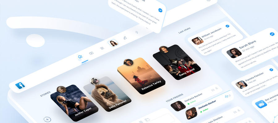
1. Dark Mode
Apple adopted the option to use Dark mode back in 2018 for its MacBook and 2019 for the iPhone, and iPad. Even though Dark Mode has been here for a long time, 2020 seems to be the year that has put it at the forefront of web design.

Career Track by Zora
For those who don’t know Dark Mode concentrates on designing with a black or dark background. Think Spotify with its opaque background and white text in the foreground.
Web designers themselves have coded in dark mode for quite a long time. It reduces eye strain and it improves visibility. Going back to Spotify, think how easy it is to read the song title, artist, and everything else.
Not only that, but it conserves battery life too. If black is the absence of light, and your screen is made out of mini-light bulbs. Dark colors would be easier to produce than a harsh white.
Not only would your website look incredible, but you would also be causing less eye strain, and conserving battery for your consumers.
2. Minimalism
This is a trend that has been brewing for a long time and it’s no surprise, people are naturally drawn to order while being repulsed by chaos.
What would you prefer, a room with clothes all over the floor, plates on the nightstand and a dirty towel in the corner, or would you prefer everything to be in their right place.
Minimalism is life’s answer to the chaotic internet. It is a way to put aside all distracting text, graphic elements, and all other information.

Armani Exchange Illustration | 01 by Leo Natsume
This can easily be achieved by letting an image say a thousand words, instead of literally using one thousand words. 2020 is all about ease of use, so it’s no wonder this and dark mode have become so popular.
3. Black and White
Black and white follows the same minimalism principles and takes it a step further. If minimalism is supposed to have no distractions with their content, then this is meant to strip away any distractions from the color palette.
When done right you can have a beautiful website, but if you are not careful they can look boring. Make sure to use high-quality images, and strike a balance with the white space.
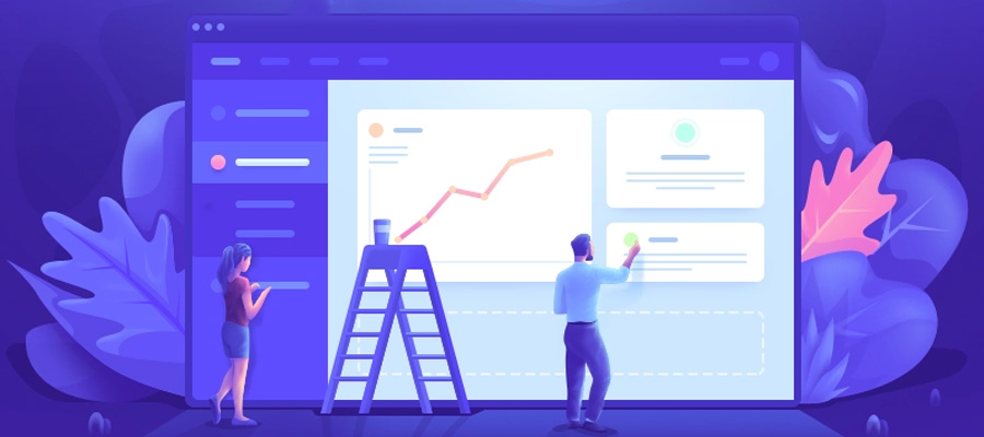
4. Bold Gradients
On the other end of the spectrum, a bold gradient and color scheme can make your website pop and feel modern.
Gradients have been here for such a long time they went out of style, only to come back with full force. Gradients used to be subtle, but now the trend is pushing towards bright colors.

Pixa by Rafal Staromlynski
It sounds contradictory to have minimalism, black and white, and bold colors all on the same list, but remember the overlying thread, usability. A beautiful bold color scheme is useless if your visitors don’t know what to do or where to go next.
5. Hand-Drawn Elements
Designers used to stay away from Hand-Drawn images or animations because it didn’t look professional and that’s still somewhat true. That’s exactly what makes this trend so amazing though.
It doesn’t matter if it’s a gorgeous “It should be in a museum,” illustration, or silly cartoon, they all portray the same thing, positivity.

Manicure Studio Web design Concept by Yana Kulakova
There are so many websites for professional businesses that could benefit from adding a little spark.
Just make sure that it is the right fit for your business. For example, if you specialize in selling hula-hoops, a fun hand-drawn character would make a lot of sense. But if you are a legal firm handling big life-changing cases, a cute cartoon would be off-putting.
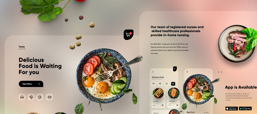
6. Mixing Illustration and Realism
When a hand-drawn illustration is not poppy enough you have to mix it with a little bit of reality. This type of design resembles a collage you would do in art class back in college or high school.
A collage is a fun and unique way to express yourself. When done right they can turn an already good image into a great one.
7. Hero Videos or Text-Only
This is part of the minimalist train of thought, but it is by no means devoid of color or style. As a matter of fact, if you are going to use this design principle you better go all out.
Because you depend on this one text or video you need to make it interesting. This is a double edge sword though if you don’t nail it, at the end of the day, all you have is huge ugly letters.
8. 3D Elements
Traditional web design specializes in 2D. In the 1990s and even in the early 2010s the internet was not what it is today. Broadband speeds were slower, and 3D elements were heavier. All of those factors combined to make it almost impossible to use 3D unless you expected your visitors to wait a whole minute for your website. Which few would.
Times have changed though. You can have a whole website with interactive 3D models, sort of like a mini video game and you can also use 3D images.
Whatever you choose just make sure that it loads quickly. It doesn’t matter if you have a gorgeous website with a cool interactive story if you keep losing customers or visitors.

Geome. by Tran Mau Tri Tam
9. Audio User Experiences
This trend is slowly taking off, but there is no doubt this is going to be an essential part of the future. Websites need to grab your attention quickly, and what is more attention-grabbing than audio.
This is another creative way to express yourself or your brand in a more personable fashion. Just make sure that it’s a relaxing sound. You don’t want to blast your visitors with a loud song.
10. Mobile Visibility and Compatibility
This goes without saying, but whatever you do, you need to optimize for mobile. 50% of all web traffic comes from mobile. This means you don’t want to design your website for half of all the internet traffic.
That number has remained steady at 50% since 2016, but that doesn’t mean that number can’t rise and with cell phones getting better each year, it’s almost a guarantee that they will.
Therefore mobile, as well as desktop should be part of your strategy since the beginning.
In Summary
All of these trends are wonderful. They look and feel modern, but the main concern in all of these is useability. User Experience or UX should be your number one concern.
Whichever trend you choose to follow make sure it is appropriate for your business. You also don’t have to pick just one. Designers will almost always combine at least two trends to create something unique and special.


 Like 198K
Comments