Infographics are valuable tools that graphic designers can use to provide an audience with valuable data and conclusions without having to barrage them with numbers. But if you make certain infographic design mistakes, your valuable information or message could be lost.
Let's break down some of the most common infographic design mistakes and go over how to fix them.
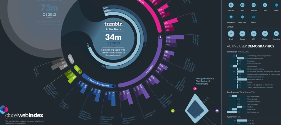
Ineffective Data Visualization
Most brands use infographics specifically for data visualization. The idea is to break down lots of hard to parse numbers into easy-to-understand graphical images. But if your graphics are confusing or ineffective at explaining information, the overall purpose of the infographic will be lost.
Data visualization can be ineffective if your infographics:
- have misleading visualization
- having correct charts
- have bad labels
- have too many graphs packed into a small space
Try to minimize this by double-checking all of your data entry before building any infographics. You should also try to keep things as simple as possible. Details and analysis are meant for Excel and other programs, not for your infographics.
Be clear about what you want to express with your data to your graphic design team. Alternatively, consider sites like Penji, an unlimited graphic design service.

infographics by Alien pixels
Too Much Clutter
Some otherwise great infographics can suffer from having too much visual clutter. You need a little bit of whitespace to prevent your infographics from feeling too cramped or stuffed with data. Some teams will create infographics that have unnecessary chart junk, 3D imagery or graphics, irrelevant illustrations, and more.
To fix this, make sure that each visual object or icon in your infographics has a purpose. Everything should work toward the same story or overall message.
Lack of a Consistent Visual “Language”
Your infographics' visual language is essentially its style or aesthetic theme. Some graphic designers may accidentally create multiple visual languages between infographics, particularly if they are part of a series. Inconsistent visual languages can make your infographics series hard to follow or lead viewers’ attention to be diverted.
Fix this by creating a strong, thematically appropriate brand style guide and language. This should include guidelines that every graphic designer must follow for each infographic they create.

infographics by Alien pixels
Inconsistent Typeface/Fonts
Similarly, some infographics suffer from having inconsistent font choices or typefaces. For instance, they may have one font or typeface size for a single infographic chart, then another font for a chart just below it. Not only does this look tacky, but it makes the overall infographic set difficult to take in as a whole.
The solution is simple – just limit how many fonts your graphic designer can use to just two or three. Give them a couple so that they can be creative and emphasize certain charts when necessary. But limiting the choices will keep things more consistent overall.
Distracting Color Choices
Lastly, some graphic designers take the concept of "popping colors" a little too seriously. They may create chaotic or jumbled infographics by mingling bright shades of green, blue, yellow, orange, and purple.
It’s always better to come up with a few dominant colors for your infographics’ color scheme, along with a couple of accent colors. This information may even be included in your brand’s style guide. Creating a good color scheme or theme will help your infographics to appear more professional and collective.
All in all, these are just a few of the design mistakes that can negatively affect your brand’s infographics. But the solutions are fortunately quite simple – keep the above tips in mind and your team will create more effective infographics in no time.


 Like 198K
Comments